INTerview: Bruce Robert Hill (The Last Man on Earth)

If one were to think of the post-apocalyptic genre, they would most likely imagine a dark, sci-fi drama set in the distant future. In fact, 9 times of 10, that would be the case.

The critically-acclaimed television series, The Last Man on Earth, is able to inject brilliant humor into a relatively dark subject matter in a unique and creative way. The series is created by Executive Producer, Writer and lead Actor, Will ForteThe Last Man on Earth is the type of show that opens a new door to architectural analysis in cinema and television.

The show alters many things that we're used to with the genre, but in inventive ways -- from showing the protagonist stealing artwork and artifacts from museums, to showing a group of survivors living in their own personal mansion in Southern California. The show is able to create a brilliant architectural and psychological discussion about space and how people use it, while still being humorous.

In an exclusive interview with Interiors, we talked to production designer, Bruce Robert Hill. The drawings, renderings, and photographs used in the show are property of Bruce Robert Hill and his team.

Warning: Minor Spoilers Below

INT: You've mentioned that you did extensive research on the Post-Apocalyptic genre. Even though The Last Man on Earth has more of a comedic take on this category, was there anything interesting that you realized about these fictional dystopian worlds in terms of Architecture/Design?

BH: I have long been a fan of the post-apocalyptic genre. It’s a chilling reality to explore and has always been fascinating to me. To take this genre and layer over it the narrative of the single cam comedy is brilliant. From an architectural and design standpoint, I feel that realism helps fortify the comedy here. It is a post-apocalyptic world, but it is still the world that we come from. We approached the design and architecture in The Last Man on Earth with this in mind.

INT: The first season was brilliant in the ways that different parts of the country were shown, especially the McMansions in Tucson, Arizona. Was Phil's housing community modeled after anywhere specific? Or was it always supposed to feel generic?

BH: Yes the McMansion sensibility and the location of Tucson, Arizona was a big part of the first season. The excesses of our culture and the inflated design sensibility of that gated McMansion world, set in the desolate climate of Arizona, seemed to be a perfect place for the character, Phil Miller, to land.   The creator/writer/producer/star, Will Forte specifically chose Tucson as the setting of the show. Aside from being a comical and terribly misguided choice as a place to survive after the pandemic, Tucson surrounds our characters with a desolate environment that helps play up the hopelessness that these survivors are feeling. The choice to go with a more opulent gated community that has been cut off from electricity and running water helps accentuate the absurd level to which our society has disconnected itself from the earth. We film this show in Los Angeles. The closest local area here that resembles Tucson is Chatsworth, located in the northwest corner of the San Fernando Valley. This is where we filmed a lot of the first season and where we found our gated McMansion community exterior. We based the design of the interior stage sets on these overblown and opulent houses.

INT: Because this is a fictional dystopian world, was it challenging having to find other locations besides Phil's house? (i.e. O'Rozco's Bar & Grille, Silvers Hardware). Or in a way, did you have more freedom because you could choose a wide range of locations since everything is available in this world?

BH: Yes. In a way, the world is Phil’s oyster. He is a kid in a candy store and the owner of that candy store died in the pandemic. This is a great layer to the comedy of The Last Man on Earth. What would you do if no one were around? We, of course, are limited by budget and, to some degree, to what is close to our studio here in Chatsworth. That said, we could also lean on the visual effects department to remove the living world from frame if we wanted to use a location that is not completely deserted. If we like a location and there are living things around, we can simply take them out in post production to keep our world deserted and void of life.

INT: You and your team masterfully built a physical set of the cul-de-sac where Phil lives. Did any design or production decisions revolutionize once you knew you were in full control of all the elements?

BH: We actually had a virtual 3D model of the cul-de-sac built by an excellent visual effect house, CBS Digital, to surround the practical cul-de-sac asphalt footprint that we created on stage. The finished virtual cul-de-sac was fed to the monitors and the camera viewfinder so that we could see how the foreground set dressing and the actors gelled with the 3D model in real time. It was an incredible tool that allowed us greater freedom to film on stage without the constraints of filming on a location.

INT: The first season mostly looked at Tucson, Arizona and the second season seems to be more focused on Malibu, California. What do you think it says about the characters in the show that they moved up to larger spaces and a more opulent area?

BH: The group split at the end of the first season. The others went west to Malibu and after some awkward reconciliation, Carol and Phil (Tandy) eventually reunite with them. I'm not sure, but it feels to me that the group simply wanted to get to a more pleasant climate than Tucson and find a very comfortable place to live. After Phil (Tandy) and Carol left they probably woke up and said, “what the hell are we doing in Tucson!”

INT: Overall, the production design is exceptional because it is able to capture realness without being over the top. What was the biggest challenge you had in trying to balance the line between being authentic and being too dark?

BH: I actually don't shy away from the dark side. I believe that the darkness helps to sell the authenticity of this pandemic world and ultimately helps intensify the comedy. Comedy can be dark and real and I think when you blur those lines the comedy hits you more deeply. Comedy comes from a deep and real place. At least good comedy does.

Bruce Robert Hill is a Production Designer and Art Director and has worked on various Films and Television Shows. You can visit his Website to see more of his work. 
INTerview: Amy Williams (Master of None)

Smart. Funny. Honest. These are the words that many have used to describe the new critically-acclaimed television show, Master of None, which debuted on Netflix on November 6th, 2015. Co-Created by Aziz Ansari and Alan Yang, the show is an honest depiction of an actor, played by Aziz Ansari, trying to make his way through life.

Master of None is the type of television show that transcends the genre. In a time where quality television programming is abundant, Master of None seems to stand out above the rest. Furthermore, one of the most captivating aspects of the show is its beautiful interior and exterior locations. These locations portray an honest depiction of New York City and this honesty goes hand in hand with the sincerity of the show.  

In an exclusive interview with Interiors, we talked to Amy Williams, who is an Emmy award winning Production Designer as well as the Production Designer for Master of None.  The Renderings and Floor Plans are property of Amy Williams and her team. 

INT: First off, we were curious how the opportunity to do the show, Master of None, came about? What was it about it that made you want to work on it?

AW: I was initially contacted to meet for the show by Gwen Bialic, a producer I had worked with on a past feature film. She brought me in to interview with the creators, Aziz Ansari and Alan Yang, because they were looking for a designer with indie film roots. I think they also wanted someone who truly knew and understood life in NYC. When we met back in January, they spoke about how they were drawn to a 1970s New York City cinematic look for the show. They wanted it to feel different and more realistic from everything else out there in the comedy realm.  It was important to steer clear of the overly lit, bright and happy looking comedies that have become commonplace.  The creators had a high aesthetic standard which was hugely appealing as a designer.  I’ve lived in NYC for 15 years and this seemed a wonderful opportunity to express and represent our shared “New York” experiences.

INT: The show has been receiving an incredible amount of attention and many critics are praising it for its honesty. A lot of that honesty is shown with your depiction of New York City and how real it feels. Was that the goal from the beginning? To create a honest representation of the city?

AW: That was the goal, exactly. NYC is a big character in the show and we wanted to represent it well, especially for those who know it intimately. 

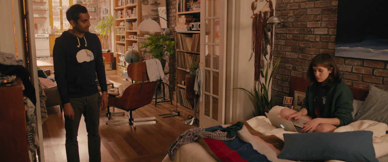
Master of None (Episode 2 "Parents")

India House Floor Plan

India House Rendering

INT: Your website discusses part of your process, which involves using reference images to creating a lookbook to building a floor plan and creating an overall layout of a space. Was this process used for any locations in Master of None?

AW: Absolutely. Creating lookbooks and sharing images is an important tool. It’s the best way to communicate to the network, producers, directors and creators what I envision and hope to achieve for the overall look of a certain set or location. Once we land in agreement, I then use these lookbooks to translate this vision to my team of decorators, set builders, scenic artists and props people. I'm particularly proud of our work for Dev's Apartment Set and the flashback scenes sets in India and Taiwan for Episode 102 "Parents".

INT: All of the locations used in Master of None seem extremely thought-out. Was there a particular Architectural Design style that you were going for? If so, what was your inspiration for these locations?

AW: Realistic, historic and sentimental were my particular aims with locations and design. 1970s and 80s Downtown/East Village imagery set the foundation for the look in terms of color palette and overall tone. But as you will see, NYC through the ages is represented, from downtown tenement buildings to the current urban rustic vibe.  Within Dev's apartment, you can see an eclectic design sense true to that of the character's many interests. From a collection of vintage Polaroid cameras, Mid-century Modern furniture pieces, Turn of the century lighting fixtures, 1970s space age electronics and lighting, Eastern European Communist era clocks, 1980s and 90s toys and games and even primitive rustic objects of interest.

INT: Some of my favorite sequences on the show are the "Walk and Talk" scenes with Dev and one of his friends in a brief conversation (Episode 2 "Parents", Episode 5 "The Other Man" and Episode 6 "Nashville") Was there any additional planning that went into these specific scenes? I'm curious if the location affected the way in which those sequences were shot.

AW: We spent a lot of time exploring certain neighborhoods and streets to find locations that would fit both the mood and tone of a particular scene. The goal was, as always, to be true to those that dwell in downtown NYC & parts of Brooklyn.  

With Nashville, we tried to feature the more interesting "tourist" spots. The types of places Dev and Rachel might explore within a short 24-hour period while in Music City. The bars, stores, restaurants and streets were all carefully selected based on my previous filming experience in Nashville as well as recommendations from our local friends. The following locations were showcased in the episode; the rooftop at Acme Feed & Seed, Manuel's Couture Shop, Santa's Pub, Robert's Western World, Printers Alley and the Hermitage Hotel to name a few.

INT: There's a strong focus on food and drinks in the show. As a result, the show contains amazing Commercial Spaces and interesting Restaurants and Bars. What was your process like in selecting these spaces? Were you looking for anything specific?

AW: Again, the goal is to “keep it real” and these real bars and restaurants are all places we know and love in our own NYC lives. Plus Aziz and Alan are massive gastronomes so we chose spots that they often patronize.  Jeff Brown, our location manager, and I spent a lot of time making sure that these were places that represented a certain timeless and sentimental feel for New York.

Dev's Apartment Inspiration

Dev's Apartment Rendering

Dev's Apartment Rendering

Dev's Apartment Floor Plan

Master of None (Episode 9 "Mornings")

INT: Our favorite episode, Episode 9 "Mornings", takes place completely in Dev's apartment and tracks Dev (Aziz Ansari) and Rachel (Noël Wells) over an 11 month period. The episode is phenomenal in terms of writing but also in the ways in which the apartment is shown and used. Was there any additional planning involved for this particular episode? 

AW: As soon as I started designing Dev’s apartment I knew we needed to plan a space with episode 109 in mind. The script for that episode was still under wraps, but Aziz and Alan explained the premise and the certain detail elements that the apartment needed for this bottle episode. With that in mind, we expanded the original size of space to provide ample shooting options and angles for the actors and camera.  I worked with Aziz for weeks sharing images and ideas from our own personal NYC dwellings to achieve a space that was real, aspirational and to his aesthetic preferences.

Amy Williams is an Emmy Award Winning Production Designer and has worked on various Films, Television Shows, Commercials and Music Videos. You can visit her Website and Twitter to see more of her work. 

INTerview: Fred Birchal

I first saw the work of Brazilian artist, Frederico Birchal, in 2013. He had just introduced his 'Famous Costumes' series, which looked at the outfits of famous celebrities. It was such a unique, creative idea and the graphics were amazing as well. Fast forward to 2015 and Frederico Birchal is back with another amazing art series called 'Famous Movies & TV Shows Setting'. In this series, Birchal has recreated architectural elevations from famous films and television shows. 

In an exclusive interview with Interiors, we talked to Frederico Birchal about his art and his latest series. 

INT: Your series, Famous Movies & TV Shows Settings, looks at Architectural Elevations from various films and TV shows. What made you want to capture the facade of these spaces?

FB: In my work, I always try to get people to pay attention to the details, specifically, objects that nobody notices. My latest series wasn't any different. I tried to show the maximum amount of details for various movie locations. These locations have a great expressiveness and they are where many things take place. Each place is a thought out location so the audience can recognize it as part of the movie. I think they are extremely important and the details cannot go unnoticed. 

INT: Some of your earlier work covered famous costumes/outfits and even famous vehicles. Now that you've examined Architecture, is there another area that you'd like to explore?

FB: Every object that represents something serves as an inspiration to me. Because of this, I want to explore other areas, but I do not know what my next series will be. Recently, I have been thinking about alternative transportation devices, such as the Tardis from Doctor Who and Pee Wee Herman’s bicycle.
 

INT: Your selections range from The Grand Budapest Hotel to Breaking Bad to Star Wars. Was there a process in which the Movies and Shows were selected? Which one is your favorite?

FB: The selection process consists of thinking about movies and television shows in which the locations express the plot. For example, The Grand Budapest Hotel is a movie where most of the plot happens in a specific place. After that, I think about the beauty and the details of each location. Finally, I think about things like how the public connects to each movie or television show. It’s hard to choose a single favorite, but the ones you mentioned are some of my favorites. 

INT: Will you continue this series with additional Films and Television Shows? If so, which ones are you most interested in creating next?

FB: I do intend to continue, but I still don’t know when or what I will do. I only know that it will have the house from Crimson’s Peak.

Fred Birchal is a Designer and Illustrator. For more of his work, please visit his Website and Online Store

INTerview: Laurent Durieux

The first time that I was introduced to Laurent Durieux's work was for the announcement of his Solo Exhibition at the Mondo Gallery. Soon, I discovered more of his work and became more and more impressed by his incredible talent. You can visit his website to see more of his work. 

In an exclusive interview with 
Interiors, we talked to Laurent Durieux about his art and his inspirations. 

INT: When did you first realize you wanted to do Art?

LD: I must have been 5 or 6 years old. My twin brother, Jack, had received praises from our teacher and so I decided I wanted to be treated the same way. I thought, "Hmm I can also draw, I can be just as good as him." That's how it all started I guess...

INT: Favorite Art Piece/Project that you've done?

LD: Hmm, it's difficult to chose one as I loved doing every one of them. Metropolis, Jaws, The Birds, Rear Window and King Kong are probably in my top 5. Wait, there's Iron Giant and Peter and Wendy too and.... See where I am going with this?

INT: Favorite Movie and why?

LD: Blade Runner because it's one of the very few science fiction movies to stand the test of time. This movie transcends the Science Fiction genre. It has the class and timelessness of the great Film Noir genre of the 1940's. The soundtrack is also just marvellous. The Photography is insane too! Man, I could praise this movie for hours!

INT: Your film posters are incredibly unique and your ability to choose interesting scenes or moments as the subject of these posters constantly amazes me. What is your process like when choosing the subject and composition of a particular poster?

LD: Thank you! You know the creative process is a strange thing. But I would say that my ideas come mostly from sketching ideas, trying out stuff, and opening doors before closing them. I always try to come up with a fresh interpretation of some scene that somehow speaks to me. I try, when possible, to think out of the box and also try not to do what has already been done by others (Which narrows down the amount of possible ideas, too).

INT: You've created iconic posters for classic films. Is it challenging to create a film poster for a movie that has such a large fan-base, such as Vertigo, The Godfather, or Die Hard?

LD: Again, thank you! You know, I challenge myself first and believe me, I am my harshest fan! And yes, for sure, you don't want to disappoint the fans of the movie (Although, pleasing everyone is pleasing no one). At the end of the day, I'm the only one that calls the shots and I have to be proud of what I do. I have to be happy with it and usually when I am, the fans are too.

Laurent Durieux is an Illustrator and Graphic Artist. For more of his work, please visit his Website

INTerview: Joel Daniel Phillips

There are times when you come across designers that add their own artistic viewpoint to an existing subject or medium. Then, there are times when you come across an artist that has not only created their own distinct style but also has the creative ingenuity that very few artists have. This perfectly describes the artist, Joel Daniel Phillips. Known for his monumental portraiture, Joel's work tries to focus on the significance of narrative in human existence. You can visit his website and Facebook Page for more of his work. 

In an exclusive interview with Interiors, we talked to Joel Daniel Phillips about his art and his inspirations. 

INT: When did you first realize you wanted to do Art?

JDP: I first realized that I wanted to make art my freshman year of college when I took a printmaking class out of the blue. At the time it seemed next to impossible to make a living as an artist and I opted for the ‘more practical’ route - deciding to study graphic design as an alternative. I realized as I was graduating however, that while I enjoyed design, the creative process was limited by the fact that at the end of the day someone else always had the final say. The financial security of a steady paycheck was alluring, but I was constantly frustrated by the feeling that whatever I was creating was not quite what I personally wanted it to be. I realized very suddenly that while it scared me shitless, I was being pulled inexorably toward a career as a fine artist instead.

After graduating I spent a few years working as a designer by day and making fine art at night and on the weekends, always aiming toward the moment when I could quit my design job and do my own work for a living. That day came almost exactly two years ago, and I haven’t looked back since.

INT: Favorite Art Piece/Project that you've done and why?

JDP: That’s a bit like asking a parent who their favorite child is. My ‘favorite’ piece changes constantly, depending on what is currently on the drawing board. I tend to fall in love with most new pieces as they are being made.

Overall though, I think my current favorite piece is Eugene #4. I don’t normally draw seated figures, and Eugene’s position was fascinating. I particularly enjoyed the way the light came almost straight across from his right, painting the edge of his face and body. There was something deeply compelling about his expression in the image as well, a striking balance between questioning and accepting.

INT: Favorite Movie and why?

JDP: At the moment I’d have to say Birdman. I don’t think I’ve ever seen a more nuanced or complete understanding of the narcissism and tension behind the creative psyche. Michael Keaton’s character is inexorably driven by his need to be recognized by others as being as important of a figure as he sees himself to be. I think that most artists or creatives of any medium have this innate hubris and ambition as part of their drive to succeed, and Keaton’s portrayal of the tensions, impossibilities and nuances involved was deeply powerful.

INT: You describe life in a circular manner, where experiences are formed and defined by others. Similarly, your work always seems to tell a story and I'm curious if you've thought about experimenting with film at all? Does cinema have any type of influence in your work?

JDP: Honestly I haven’t really thought about that much. I know just enough about film and the processes behind it to realize how much of a technical skill set is involved, and that the moment I’m content continuing to learn how to draw.

INT: Where do you see your art going? Do you have any goals in terms of work you'd like to do and projects you'd like to try?

JDP: Hmm, I always have a million and one projects I want to work on, but I generally try and keep things under wraps until I start making the actual work. A new body of drawings that I’m quite excited about however, is in conjunction with my residency this summer at the Palo Alto Art Center.

Over the past two years there has been an ongoing legal battle in Palo Alto about whether the owner of Buena Vista Mobile Home Park (located in smack in the middle of the city) is allowed to evict the longstanding residents of the park and sell the property. The park is home to around 400 residents, many of whom have lived there for many years, and is some of the last truly affordable housing in Palo Alto. If evicted, most of the residents will have no choice but to leave the city. For the residency I have begun visiting the park and shooting photo references of the residents and their wonderfully varied abodes, and will be creating a body of work that I hope will explore the connection between the residents and their homes, as well as the myriad of social and economic questions that have arisen around the issue of their eviction.