INTerview: Blank Space

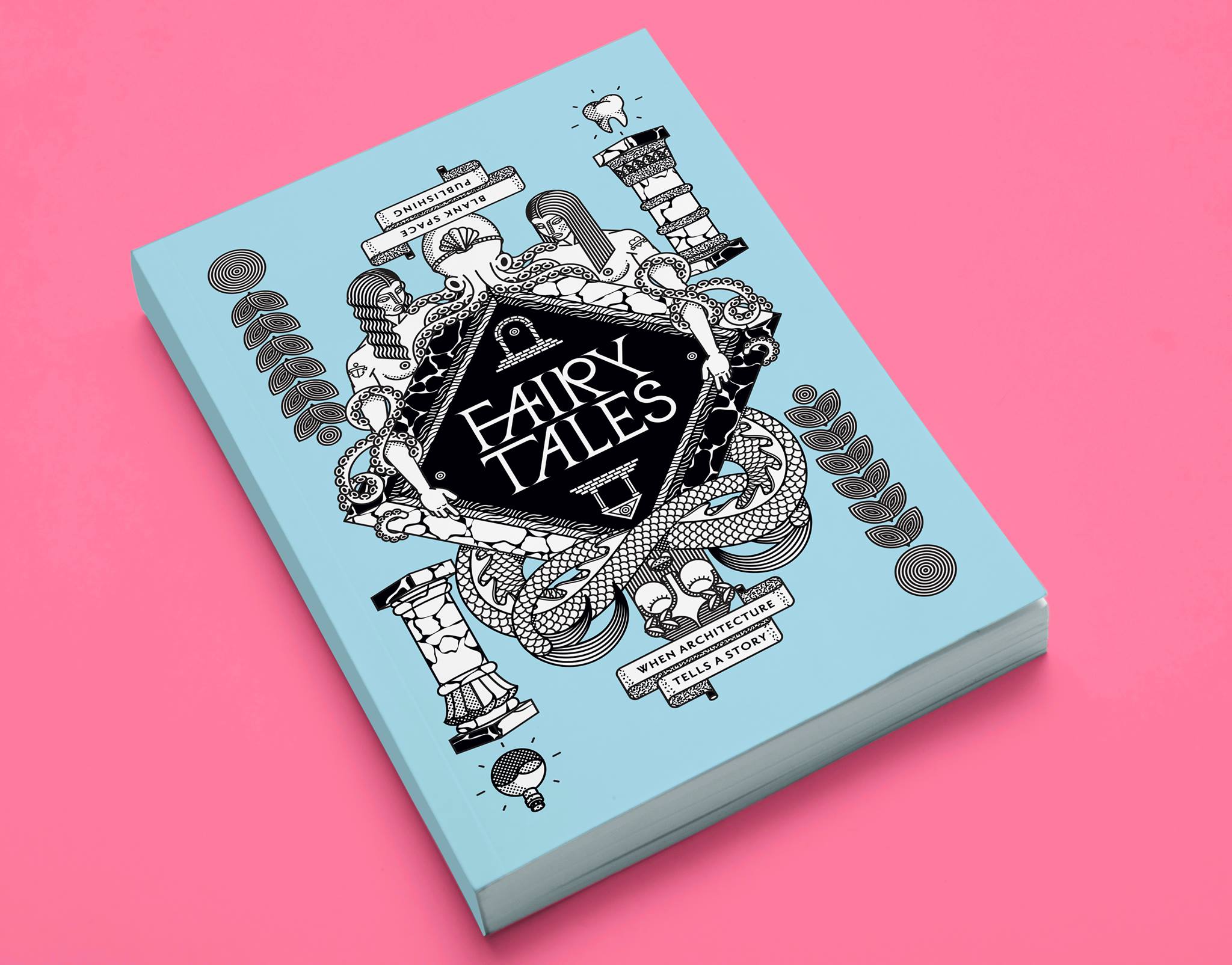
Blank Space, an online platform for architecture founded by Matthew Hoffman and Francesca Giuliani, is an office for thought provocation. It seeks to challenge the field of Architecture and its role in society. They've proven this by organizing successful Architectural competitions, publications and various projects.

Their philosophy may sound straightforward, but what they are doing is revolutionary.  In a sense, they are progressing the field of Architecture in an intelligent, immediate way that a physical space could never accomplish. Additionally, they are completely changing the concept of Architectural competitions and making it possible for participants from various backgrounds to create new conversations about innovative topics.

In an exclusive interview with Interiors, we talked to Blank Space about their platform, their philosophies and their competitions.  

INT: Where did the inspiration for Blank Space come from? Was the original concept different from what you are doing now or has the goal stayed the same?

MH: Blank Space was born from a lot of conversations and brainstorming between Francesca and I. We came to understand that architecture as a form of media is the slowest in the world - but the world we all live in communicates at the speed of light. We set out to craft experiments that made architecture immediate. You can't construct a building in a day (at least not yet!), but you can spark a conversation that creates new opportunities for design to engage the world.

FG: With the Fairy Tales competition we've had about 2,000 participants from 65+ countries around the world. We're aiming to build upon this success with a few exciting projects that we'll launch later this year. We're going to be enhancing the competition model to become a more educational one for all involved. Our goal is to create competitions that operate more like a studio class, and less like a lottery. In this way, they will be positive learning experiences for everyone who participates - not just the winners.

INT: You've discussed how Architecture should rethink its role in society and speak about things everybody can relate to. In what ways do you think Architecture should be doing more?

MH: Perhaps my biggest beef with architecture is that it remains a service profession. Architects are always waiting around for a client, and architects are always working to realize someone else's architectural vision. Architecture competitions have existed for hundreds and hundreds of years - and they are based on the exact same premise that holds back architecture - except the "client" is replaced by the "brief". With our competitions we set out to invert the whole process and place architects and designers in the driving seat. An added benefit of lowering the entry barrier to architecture is that we have lots of non-designers participate in our competitions. Everyone wants to be an "architect" in some capacity - we aim to create opportunities that allow for that.

INT: Are there certain Architects, Firms, or Groups that you feel are progressing the field of Architecture in the right direction? Where do you see Architecture going in the next 5-10 years?

MH: We've been honored to have a wide range of superstars on our competition juries. In many ways they represent our "heroes" from the design, architecture, and business fields. Folks like Mitchell Joachim at Terreform ONE, where they are creating a fantastic architectural laboratory in the Brooklyn Navy Yards; to the team at Bruce Mau Design who are constantly pushing the design and communications envelope; to the radical personality that Matthias Hollwich and Marc Kushner at HWKN Architects have been able to inject into their architecture projects. There are many more people and companies pushing at the edge of architecture, and we couldn't be happier to work with them.

FG: One of the biggest take-aways from the entries we've received is that younger generations are keen to produce really innovative ideas that reach far beyond traditional architecture. There is a great interest in affecting the world beyond the typical Schematic Design to Construction Administration phases. This ability to act as a catalyst for change is paramount - it means that the newest generation of architects are breaking tradition from architecture as a service profession, to developing their own ideas and then figuring out how to realize them of their own accord. This is a fundamental shift, and a much needed one, and we couldn't be more excited to contribute.

Fairy Tales: Volume 1

Fairy Tales: Volume 1

Fairy Tales: Volume 2

Fairy Tales: Volume 2

INT: You've put together some amazing Architectural competitions, including Fairy Tales: Volume 1 and 2 and your latest competition, Dear Architecture. Can you talk about where the ideas for these competitions came from?

MH: Starting Blank Space was not a fast process. Deciding on the topic of our first competition, Fairy Tales, was actually the toughest part of getting off the ground. I think it took Francesca and I about 6 months to settle on Fairy Tales. Of course we wanted to do something different than typical competitions, which wasn't very hard because they all ask you to design 1. A Skyscraper, 2. A Museum or 3. A House. So those three options were out - and we started searching for something else - something powerful that elicits an immediate reaction. We ran with Fairy Tales because it is exactly that - it embodies a very strong subject, yet it is completely open to interpretation. Each person has their own personal fairy tale.

FG: Dear Architecture is our third competition - we just launched it a month ago as a new experiment and things are going well so far. With Dear Architecture we wanted to tackle one of the most pervasive and influential formats of all time - the simple letter. Well-crafted letters have changed the world and circulated innovative, game-changing ideas. We expect the entries to Dear Architecture to do nothing short of that.

INT: You've created such a unique and interesting platform with Blank Space. Where do you see the office going? Are there certain areas you would still like to explore? 

FG: The Fairy Tales and Dear Architecture competitions have worked well so far, but they are hardly the only topics we want to cover. We're developing a new competition for this fall that will take a more science-based approach. We're excited to explore new territories - it's really an adventure for us. The reality is that every time we launch a new project we have only a faint inkling of what the final results might be. Each participants uses the brief as a catapult to explore previously uncharted territory for architecture. The unknowability of the final results is where the real magic comes from.

Blank Space is an online platform for architecture, founded in 2013 by Matthew Hoffman and Francesca Giuliani. 

INTerview: Hey Studio

Hey, a graphic design studio based in Barcelona, Spain, focuses on transforming ideas into communicative graphics. We stumbled upin their "Every Hey Illustration" series on Instagram, after first discovering their brand identity projects. Hey has been creating pop culture icons for more than a year in their own unique graphic style, posting one per day on an Instagram account. These icons are minimal, dynamic and incredibly unique.

In an exclusive interview with Interiors, we talked to Hey about the "Every Hey Illustration" series, as well as their other amazing work. 

INT: How did the idea for the "Every Hey Illustration" come about? Was it always the plan to post a new illustration every day on Instagram?

HEY: These character designs came from an illustrated world map commission. I needed to add characters doing different sorts of things but the scale at which I was drawing them wasn't helpful so I decided to design these geometrical characters with the least amount of detail as possible.

Normally, I'll have all of the characters or objects drawn in a single file so that I can draw faster. The result is, more or less, the same look of the Instagram profile. Additionally, I thought it would be nice for me to grow the style and post one daily as a kind of drawing exercise.

INT: We noticed that the characters you have created range from movies, television, pop-culture and sports. Is there a method to choosing new characters or a list that you follow?

HEY: There no list behind it. Sometimes it is just what I want to draw or suggestions from followers or from trending issues. At the beginning, it was easier to do characters with recognizable features, such as superheroes or music artists. Even without something recognizable in the characters, people could still solve most of them.

INT: You've successfully been able to post a new character every day for over a year. How long do you think it can go? Do you think there will ever be a shortage of characters?

HEY: I’m very happy and impressed by how much the project has grown. I never imagined the amount of support that I would receive from people telling me to keep doing the characters every day. I've been doing this for them and for me, but to be honest, I think I'm satisfied. My interest is to find new things to do. I'm going to close some of the characters and think of a good way to close the project. However, the Instagram account could remain open and characters could be added occasionally.

INT: You've managed to create an extremely unique style with the characters you have made. Have you thought about creating more original characters and telling your own narrative (much like the Oh My God Exhibitions)?

HEY: In fact, the character style known as “every_hey” are part of a bigger representational style. This character style is still present in the professional commissions that we do. The only difference is that we try to adjust them by creating different narratives. I guess it could grow in several directions. 

INT: Some of your Editorial Design work is absolutely amazing. We're curious if you've thought about doing the graphics or typography for a movie poster or a film's title sequence?

HEY: We actually started as a graphic design studio and later added a part for illustration. Also, we have been working on the type credits for a documentary of the glass blower artist, Jeremy Maxwell Wintrebert, in collaboration with Jérôme de Gerlache.

INT: Is there a plan to put some of the more popular characters on merchandise and sell it on your store? Or a larger print featuring a group of characters? 

HEY: This is a good question. We have actually been thinking about that for the past two months because we have received such a big demand. I’m afraid that most of the fictional characters have specific property rights. We don’t want to infringe on those rights so we are planning to properly format the work done on Instagram and give our followers the chance to have a physical piece. They deserve it.

Hey is a graphic design studio based in Barcelona, Spain. They specialize in brand identity, editorial design and illustration. They love geometry, color and direct typography. That's the essence of who they are. 

INTerview: Never Made (Francisco Reyes Jr.)

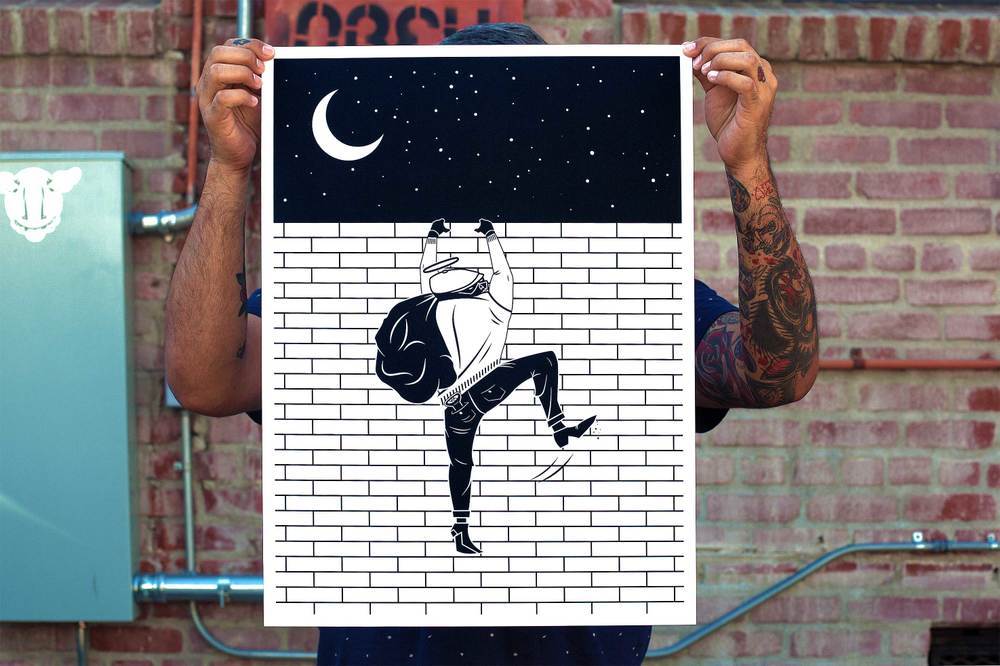
While scrolling through my Feedly account, I came across a print release from the artist, Francisco Reyes Jr., who produces work under the name, Never Made. Francisco is a Los Angeles based Graphic Designer and Artist currently working for Obey Giant. He had just released his print, "Creepin On A Come Up", and I was instantly drawn to the subject matter and the incredible graphics. You can visit his Online Store and his Instagram to see more of his amazing work. 

In an exclusive interview with Interiors, we talked to Never Made about his art and his inspirations. 

INT: When did you first realize you wanted to do Art?

NM: I always liked to draw. I didn't think much of it, it was just something I found pleasure in. 

I used to try to be really good at drawing as realistic as possible. I would also try to draw my favorite characters in the exact way they were drawn on the covers of comic books and on X-Men cards. I really sucked, but I didn't care! I just liked to do it. 

However thinking back on it now, my dad used to take my brother and I to the video store every Friday to rent video games movies and I would always base my choice of movie or game on the cover art. I'd look for the most catchy covers and that would be my choice. Even if i had no idea what the movie was about. The cover art sold me. Meet the Feebles by Peter Jackson is one that stands out the most. My mom flipped out when she saw what I was watching and she yelled at my dad. Google it. 

I've always been into visuals but I was never that good at "Fine Art." I used to be an aspiring musician. My art teacher in high school wrote in my yearbook, "Art really isn't your thing... Stick to playing guitar." When I came across Illustrator and Photoshop and learned what Graphic Design was, that was it for me. I knew that's what I wanted to do for a living. So after high school, I enrolled into design school and got my degree in Graphic Design. 

I'm fortunate enough to be doing what I love for a living. It's a tough and competitive industry and I'm thankful everyday for the job I have. 

INT: Favorite Art Piece/Project that you've done?

NM: My favorite art project has been definitely developing my little homie, Crispin

I guess my favorite art "collective" that I’ve done would have to be the graphics that I did for Obey Clothing. It trips me out when I'm out and I see people in public wearing something that I designed. It's a trip.

INT: Favorite movie and why?

NM: I have a bunch, but I'll give you two. The Fountain, for sure. It's a story of eternal life, death and love, mixed in with some amazing visuals, a great story and a fucking awesome score. It's a home run in my book, and most of Darren Aronofsky’s films are. The film didn't get much love at the box office, but it's one of those gems you have to find for yourself.

My second would a French film named Jeux d'enfants (Love Me If You Dare). The visuals and cinematography are awesome and the story is really charming. I'm a sucker for movies about love, for sure. 

I also love World War II movies and all the classic mobster movies, like GoodfellasThe Godfather and A Bronx Tale.

INT: How would you describe your Art to someone? What does it mean to you?

NM: Minimal with as much visual impact as I can make using a limited color palette (almost always black and white). I try to make things as simple and iconic as possible, so people can remember it. My work keeps me sane. It gets my mind off whatever tribulations are going on in my life. If I'm not working on something, I'll get super bored and just start to think too much and give myself anxiety, of which I have enough of already. It's therapeutic for me. 

INT: What's your go-to inspiration? Someone/Something that you're continuously inspired by?

NM: Shepard Fairey has always been my go-to inspiration. Even before I worked for him, I was the biggest fan boy. I would study his work and couldn’t get over how iconic and powerful yet simple his work was. It was something I had always strived for in my work and still do. 

I get inspired by so much. I’m very observant and anything could spark an idea in my head. For example, if I’m listening to a song that has a certain lyric that stood out to me, I'll paint a visual picture of what the lyric would look like. Then I start to brainstorm a central icon or icons and visualize typography to go along with it. I do that with pretty much everything I hear, see, and feel. Or sometimes, I just get the urge to make cool shit with no real meaning behind it. If it's aesthetically pleasing, I’m down with it.  

INTerview: Jacob T. Swinney

First and Final Frames is a video from Jacob T. Swinney, who edited together the opening and closing shots from fifty-five films. The shots are paired side by side and the resulting effect is a reminder of how powerful individuals shots in cinema are. In comparing the opening and closing shots of a film together, we are provided a look into how these individual shots tell an entire story.

Birdman (2014)

The video consists of a wide range of films, from films such as Blue ValentineThe Godfather: Part IINever Let Me GoHungerSolaris and The Searchers. In putting these images side by side, we learn about the different ways in which filmmakers open and close their stories -- some of these complement each other, as in the case with many films, such as Black SwanBirdman, and Raging Bull, while others are less direct, but equally thought-provoking.

Interiors spoke with the man behind these images.

The Master (2012)

INT: What is your background in?

JS: I love every aspect of filmmaking, so I learned how to do a bit of everything. But my three most prominent areas are directing, cinematography, and editing. 

INT: Do you see Vimeo as a website that is more concerned with film and artistic expressions, with videos like yours that shed more light onto films, as opposed to the likes of YouTube, which is more concerned with the sharing of videos?

JS: Absolutely! The Vimeo community seems to be much more concerned with original content and artistic expression. YouTube is also very useful, but for different reasons. There seems to be a larger opportunity for "going viral" and it is a helpful resource for gathering film clips.  I prefer Vimeo because all of the members seem to have an interest in cinema and filmmaking. Also, it is not likely that you will get harassed or abused through Vimeo comments. YouTube can be rather brutal in that respect. 

Her (2013)

INT: How did this particular idea come along?

JS: I was actually watching Gone Girl in the cinema and was struck by the similarity of the opening and closing shots. This got me thinking, "What other films use this 'bookend' technique?" After doing some research, I became fascinated by the significance of the opening and closing shots in so many films. This inspired me to expand from the idea of just "bookends". 

INT: Can you talk about your choice of the films you included in this video?

JS: I chose films that displayed one of three types of openings/closings: very similar or identical shots (bookends), vastly different shots, and equally impactful shots. But most importantly, I wanted all of the examples to tell a story simply through two shots. Some are much less obvious than others, but I feel that each example communicates something significant. 

Shutter Island (2010)

INT: What is the process like for making a video like this? How long does it take? How difficult is to find some of these clips -- even just in terms of matching the resolution and making sure they're all as high quality as possible?

JS: My enormous movie collection is finally paying off because I own just about every film used in the video. So fortunately, I didn't have to worry too much about scavenging for clips and matching quality. But that does mean that I have to devote a rather large amount of time to the slow and monotonous DVD/Blu-ray ripping process. This is definitely my least favorite part of creating a new video. Luckily, I have recently been able to devote a computer entirely to ripping. This allows me to continue to edit as I collect footage, which is immensely helpful. For this particular video, that editing process was rather simple. Usually I have to spend a great deal of time watching the films and searching for useful bits, but in this case, I obviously knew exactly where each clip was located. 

INT: The question you pose in the description of this video is, "What can we learn by examining only the first and final shot of a film?" What did you learn from analyzing the first and final frames of these films? Did anything surprise you? Did you learn anything?

JS: I learned that a whole lot more thought and theory goes into choosing an opening and closing shot than I had originally believed. This is most likely not the case with all films--I went through several films that open more traditionally with establishing shots. But I was truly blown away by the fact that so many films can communicate an entire story with just their opening and closing shots, even out of context. Punch-Drunk Love, Brokeback Mountain, and Birdman particularly stick with me. My hope is that viewers will learn as much from watching the video as I did by making it.

INTerview: Snarkitecture

Snarkitecture, a collaborative practice formed by architect Alex Mustonen and artist Daniel Arsham, is the quintessential collaborative duo. They each bring in their own expertise to their work; as a result, their projects cannot be explained as an architecture or art project, but rather, a category of its own. Their clean, minimal aesthetic mixed with their masterful sense of scale and space have allowed them to create a wide range of projects, that include pavillions, runway shows, window displays and furniture.

Their beginning started by chance in 2006, with Alex Mustonen being enlisted by Daniel Arsham to help with the architectural aspects of an installation at Dior's retail store in Los Angeles, California. If it wasn't for this collaboration, Snarkitecture may have never been born two years later. They've managed to create an incredible range of projects but it still feels that they've only just scratched the surface.  

In an exclusive interview with Interiors, we talked to Snarkitecture about their inspirations, their incredible projects and their future.

INT: The spectrum between "architecture" and "art" is such a unique aspect in your projects and it almost feels as if you've created your own category. Is this or has that always been the intention?

SNARKITECTURE: Definitely. Coming from our respective backgrounds in art and architecture (but with mutual interest in each others disciplines), there was always the intention of exploring the strange space that can exist between art and architecture. We are increasingly working at larger, more architectural scales, but always with elements that push the work into unexpected places for visitors.

INT: In all of your projects, there is a distinct elegant quality. Who are some artists or architects that you take inspiration from, if any? Do you typically find inspiration from designers that have a similar methodology?

SNARKITECTURE: There are certainly artists, designers and architects whose work we admire and respect, but they don't act as a primary influence for Snarkitecture. Our inspirations are just as likely to emerge from dreams, natural landscapes, the way we saw a child interact with architecture, or the music we're listening to in the studio. 

Drift (2012)

INT: There are several of your projects that are designed as distinct areas or environments (Dig,Richard Chai, Drift), which almost feel reminiscent of a film set. In fact, you could almost imagine an entire film production based on one of your projects with distinct visuals and characters. Have you ever thought about creating these environments for a film?

SNARKITECTURE: Daniel is actively working on this right now through his Future Relic film series, which is very much about creating specific environments that relate to his art work (separate from Snarkitecture). That said, I think we would be game to approach the design of an environment for film - it would be distinctly different than how we normally operate, which is to say that we are nearly always creating spaces and objects which people will physically interact with directly.

INT: You've worked on projects that include different types of performance art, whether it be a performance in the Why Patterns or a fashion runway show for En Noir. These two examples could be seen on opposite spectrums with one being very spontaneous and the other being carefully planned. Are you interested in exploring this spectrum more with future projects?

SNARKITECTURE: While Why Patterns certainly revolves around ideas of chance, it's not necessarily something I would describe as spontaneous. There is a careful and extensive amount of planning that goes into each project we do. A project that might only last 15 minutes can go through a year of design and development from the first stage to the final product. We are interested in these types of projects because they allow us to design a moment that can only really be appreciated in full by being there in person an experiencing it. 

In response to your question, we are very interested in continuing to explore and push how performance can alter and manipulate architectural space.

En Noir FW14 (2014)

Airball (2014)

Why Patterns (2010-2012)

Richard Chai (2010)

INT: You've mentioned before that you'd like to see an entire space or building as a Snarkitecture project, where the space is designed by you, as well as the objects in the space. Is that still something that you are working towards? Do you have any additional aspirations for future projects?

SNARKITECTURE: Definitely. It's still on the list and we have a few things in mind...

The next big things for us are an immersive collaboration with COS for Salone del Mobile in Milan in April, a project with Print All Over Me at New Museum in New York in May and a massive installation opening this summer in the US that we can't tell you about yet. Stay tuned.

Snarkitecture, established by Alex Mustonen and Daniel Arsham, is a collaborative and experimental practice operating in territories between art and architecture. Exploring the boundaries of disciplines, the studio designs permanent, architectural scale projects and functional objects with new and imaginative purposes.