INTerview: Amy Williams (Master of None)
/Smart. Funny. Honest. These are the words that many have used to describe the new critically-acclaimed television show, Master of None, which debuted on Netflix on November 6th, 2015. Co-Created by Aziz Ansari and Alan Yang, the show is an honest depiction of an actor, played by Aziz Ansari, trying to make his way through life.
Master of None is the type of television show that transcends the genre. In a time where quality television programming is abundant, Master of None seems to stand out above the rest. Furthermore, one of the most captivating aspects of the show is its beautiful interior and exterior locations. These locations portray an honest depiction of New York City and this honesty goes hand in hand with the sincerity of the show.
In an exclusive interview with Interiors, we talked to Amy Williams, who is an Emmy award winning Production Designer as well as the Production Designer for Master of None. The Renderings and Floor Plans are property of Amy Williams and her team.
INT: First off, we were curious how the opportunity to do the show, Master of None, came about? What was it about it that made you want to work on it?
AW: I was initially contacted to meet for the show by Gwen Bialic, a producer I had worked with on a past feature film. She brought me in to interview with the creators, Aziz Ansari and Alan Yang, because they were looking for a designer with indie film roots. I think they also wanted someone who truly knew and understood life in NYC. When we met back in January, they spoke about how they were drawn to a 1970s New York City cinematic look for the show. They wanted it to feel different and more realistic from everything else out there in the comedy realm. It was important to steer clear of the overly lit, bright and happy looking comedies that have become commonplace. The creators had a high aesthetic standard which was hugely appealing as a designer. I’ve lived in NYC for 15 years and this seemed a wonderful opportunity to express and represent our shared “New York” experiences.
INT: The show has been receiving an incredible amount of attention and many critics are praising it for its honesty. A lot of that honesty is shown with your depiction of New York City and how real it feels. Was that the goal from the beginning? To create a honest representation of the city?
AW: That was the goal, exactly. NYC is a big character in the show and we wanted to represent it well, especially for those who know it intimately.
Master of None (Episode 2 "Parents")
India House Floor Plan
India House Rendering
INT: Your website discusses part of your process, which involves using reference images to creating a lookbook to building a floor plan and creating an overall layout of a space. Was this process used for any locations in Master of None?
AW: Absolutely. Creating lookbooks and sharing images is an important tool. It’s the best way to communicate to the network, producers, directors and creators what I envision and hope to achieve for the overall look of a certain set or location. Once we land in agreement, I then use these lookbooks to translate this vision to my team of decorators, set builders, scenic artists and props people. I'm particularly proud of our work for Dev's Apartment Set and the flashback scenes sets in India and Taiwan for Episode 102 "Parents".
INT: All of the locations used in Master of None seem extremely thought-out. Was there a particular Architectural Design style that you were going for? If so, what was your inspiration for these locations?
AW: Realistic, historic and sentimental were my particular aims with locations and design. 1970s and 80s Downtown/East Village imagery set the foundation for the look in terms of color palette and overall tone. But as you will see, NYC through the ages is represented, from downtown tenement buildings to the current urban rustic vibe. Within Dev's apartment, you can see an eclectic design sense true to that of the character's many interests. From a collection of vintage Polaroid cameras, Mid-century Modern furniture pieces, Turn of the century lighting fixtures, 1970s space age electronics and lighting, Eastern European Communist era clocks, 1980s and 90s toys and games and even primitive rustic objects of interest.
INT: Some of my favorite sequences on the show are the "Walk and Talk" scenes with Dev and one of his friends in a brief conversation (Episode 2 "Parents", Episode 5 "The Other Man" and Episode 6 "Nashville") Was there any additional planning that went into these specific scenes? I'm curious if the location affected the way in which those sequences were shot.
AW: We spent a lot of time exploring certain neighborhoods and streets to find locations that would fit both the mood and tone of a particular scene. The goal was, as always, to be true to those that dwell in downtown NYC & parts of Brooklyn.
With Nashville, we tried to feature the more interesting "tourist" spots. The types of places Dev and Rachel might explore within a short 24-hour period while in Music City. The bars, stores, restaurants and streets were all carefully selected based on my previous filming experience in Nashville as well as recommendations from our local friends. The following locations were showcased in the episode; the rooftop at Acme Feed & Seed, Manuel's Couture Shop, Santa's Pub, Robert's Western World, Printers Alley and the Hermitage Hotel to name a few.
INT: There's a strong focus on food and drinks in the show. As a result, the show contains amazing Commercial Spaces and interesting Restaurants and Bars. What was your process like in selecting these spaces? Were you looking for anything specific?
AW: Again, the goal is to “keep it real” and these real bars and restaurants are all places we know and love in our own NYC lives. Plus Aziz and Alan are massive gastronomes so we chose spots that they often patronize. Jeff Brown, our location manager, and I spent a lot of time making sure that these were places that represented a certain timeless and sentimental feel for New York.
Dev's Apartment Inspiration
Dev's Apartment Rendering
Dev's Apartment Rendering
Dev's Apartment Floor Plan
Master of None (Episode 9 "Mornings")
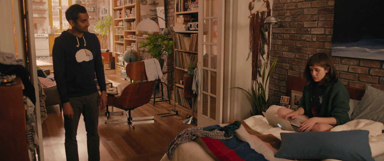
INT: Our favorite episode, Episode 9 "Mornings", takes place completely in Dev's apartment and tracks Dev (Aziz Ansari) and Rachel (Noël Wells) over an 11 month period. The episode is phenomenal in terms of writing but also in the ways in which the apartment is shown and used. Was there any additional planning involved for this particular episode?
AW: As soon as I started designing Dev’s apartment I knew we needed to plan a space with episode 109 in mind. The script for that episode was still under wraps, but Aziz and Alan explained the premise and the certain detail elements that the apartment needed for this bottle episode. With that in mind, we expanded the original size of space to provide ample shooting options and angles for the actors and camera. I worked with Aziz for weeks sharing images and ideas from our own personal NYC dwellings to achieve a space that was real, aspirational and to his aesthetic preferences.
Amy Williams is an Emmy Award Winning Production Designer and has worked on various Films, Television Shows, Commercials and Music Videos. You can visit her Website and Twitter to see more of her work.


