INTerview: Kim Schneider

Arguably, some of the most interesting Architectural Spaces in a Film or Television Show are the Offices, Coffee Shops, Bars or Retail Stores. They usually feel the most familiar because these are Commercial Spaces that we, the audience, spend most of our time at. For example, Shows like The Office are so connected with their Office Building that it seems abnormal to watch the characters in any other setting other than their office space. We came across these incredible Architectural Drawings from Graphic Designer, Kim Schneider, and wanted to find out how she able to create such dynamic Floor Plans for these Commercial Areas. 

Interiors spoke with Kim Schneider about this project and her inspirations.

INT: You specialize in Graphic Design (Print, Branding, Logos, Visual Design, Etc.) What made you want to create Architectural Floor Plans? Had you done any Architectural work beforehand? How would you describe your Graphic Design and Illustration style?

KS: Bizdaq, an online marketplace for buying and selling businesses, contacted me about doing a series of illustrations for them, in the way of favorite floor plans from TV shows and movies. I had seen a few sets of similar illustrations floating around the internet in the past and was always intrigued by how designers pulled them together. I've taken a few architecture basics courses in university, and spent plenty of time building houses out on The Sims, so it was fun to combine my past experiences with the rigidity and structure of architectural work & knowledge of spacial design with my color-infused, detail-oriented & quirky design style.

MAD MEN

The Simpsons

Star Wars

The Big Bang Theory

INT: The Floor Plans that you designed include institutions from The Office, Friends, The Simpsons, Mad Men and many others. Which one was your favorite to create? Did you feel an attachment towards any of them specifically? 

KS: Each floor plan was its own unique journey to make - oftentimes scouring an episode for a correct carpet or table top color, or Google searching images to find the way Don Draper's desk was organized or how walls really fell within the offices. I knew I would never be able to construct perfectly accurate descriptions of the spaces, so I made sure each color palette fit into the cinematography's atmosphere, and nuanced as many inside joke elements within each show as I could. If I had to pick a favorite, the Dunder Mifflin Scranton branch of The Office has always been a place of comfort and hilarity for me - but the rugs in Central Perk & the vintage vibe Mad Men brings were also super fun to work on.

Friends

INT: Usually, Office and Business spaces feel very rigid but you managed to create incredible, dynamic graphics for all of them. Was there anything that you noticed about this type of space white creating the Floor Plans?

KS: Thank you! It was important for these floor plans to look like illustrations to me, and less like flat, structured designs - so I worked to add textures, pops of contrasting color, and lots and lots of little moving parts and elements, to fill up the spaces with the feeling of the characters their audiences love so much. While many elements of architectural design are clean, minimal and corporate, office spaces - and the structures featured in these floor plans - are all places of community, of gatherings, of where different people are spending hours upon hours together, everyday. These places hold more than just the white-washed walls and classic tan of a desktop, and injecting the life, laughs, triumphs alongside familiar staples was so essential for the floor plans to be successful and dynamic.

INTerview: Floor Plan Croissant (Boryana Ilieva)

Architectural Representation has always been a topic of much discussion. One of the many great aspects of Architecture is how Architects and Designers all find unique ways to interpret 2D Drawings. Even Interiors has found new ways to represent Floor Plans and Elevations over the years. When we came across Floor Plan Croissant’s Instagram Page, we were inspired by the way she was able to blend technical Architectural Drawings of popular Television Shows and Films with a realistic, warm watercolor overlay. Her work proves how lively certain forms of representation can be.

Interiors spoke with Floor Plan Croissant (Boryana Ilieva) about her work and inspirations.

INT: Can you share some information about your background in Architecture? How did you first come up with Floor Plan Croissant? Also, what does the name mean?

FPC: Back in 2008, I co-founded an architectural studio in Sofia, Bulgaria, under the name of 11AM. Together with Panayot Savov ─ also an architect, we develop small design projects, mostly condo interiors and single family houses. I have to acknowledge Savov’s tremendous help in the film interiors venture. As a tutor in public buildings at The University of Architecture, Civil Engineering and Geodesy (UACEG) in Sofia, he adds a solid theoretical backup to every film house explored.

The birth of Floor Plan Croissant was only a question of time as movies were always an inseparable part of my life. Intersecting them with architecture as an autonomous project happened in the winter of 2015. One evening, after seeing Elena by Russian director Andrey Zvyagintsev, I had that gorgeous Moscow condo from the film dancing in my mind the whole night. In the morning, I roughly sketched its floor plan. It was the official beginning of my upgraded relationship with cinema. From that time on, through the language of architecture, I have been able to translate many of the messages sent by directors and cinematographers in their work.

As for the name, it's kind of a morphological thing. Before baking croissants, they seem like wrappings but heat makes them get their own visual mass. They are transforming into something special. And they are tasty.

INT: Do you have a process of how you choose the Films/Spaces that you draw? Are they Films that you’re a fan of or is it more about the Space?

FPC: Film always comes first; Space comes later. Rooms don’t hit you immediately and directly. Living spaces that exist and play their quiet role to support a powerful story in the film ─ or even to build its structure discreetly ─ are my absolute favorite spaces. I love bringing life to those kinds of spaces. I enjoy showing people the architectural gems that some may fail to notice.

INT: What have been some of your favorite pieces to work on? Are there any drawings that you are particularly proud of?

FPC: In 2015, I explored the houses in five films which treat a specific subject: "the phenomena of the un-self-doppelganger persona". The films were Twin Peaks by David Lynch (Laura’s House), Clouds of Sils Maria by Olivier Assayas, The One I Love by Charlie McDowell, Frank by Lenny Abrahamson and The Lady in the Van by Nicholas Hytner.

This project still remains the one I’m most proud of because of all the architectural clues I discovered in the houses that I painted. Each home spoke to me in the language of architecture about cloning processes, shadow selves and twins. I adored how Maria Enders (Juliette Binoche) and her assistant Valentine (Kristen Stewart) doubled their personalities in the Sils-Maria Alpine house, spending days and nights at that dining table between two perpendicular corner mirror-windows. In esoteric terms, meeting those reflective surfaces in that way means so much to me. Another example is in Laura Palmer’s home: the asymmetrical and central staircase is a kind of portal that drags the weirdest creatures from Black Lodge to the second floor.

In the first teaser of the highly anticipated Twin Peaks show sequel, Deputy Hawk says, "location sometimes becomes a character." I feel that the houses in those five films I studied provoked the phenomena of the other self. This is why these five locations are characters. Another piece that I am proud of is the painting which illustrates the floor plan of Will Byers's house in Stranger Things. The watercolor/acrylic technique was a personal success and creating the glowing effect taught me about how important a conductor the lights were between the two worlds. 

INT: The drawings that you create seem to come alive once they are painted. Have you discovered anything unique about Architectural Drawings and Representation?

FPC: Thank you, that means a lot. Watercolor technique was the handiest (and the hardest, because it excludes repairing). One day, I will probably switch to something else like modeling with clay, constructing with Lego blocks, or whatever will give a good architectural expression. The most important thing for me is to work with my hands. By doing so, I initiate certain analytic processes. As far as the final result is concerned, it becomes something more than a colorful sign or scheme of space. It becomes an autonomous object, a copy with no original ─ specific form of simulacrum in Baudrillard’s terms.

INT: Where do you see this series going? Do you have any goals in terms of Films you’d like to do and projects you’d like to try?

FPC: At this particular moment, I’m working on a lecture for students in Production Design at The National Academy of Theatre and Film Arts (NATFA) in Sofia where I was invited as a guest lecturer to talk about Floor Plan Croissant’s discoveries so far.

Apart from that, I look ahead towards the movies that are releasing in 2017 and the potential "home-characters" to be studied. I’m particularly impatient to see Haneke’s new work and I’m curious about Lars von Trier’s The House That Jack Built and Sofia Coppola's new feature, The Beguiled. In addition to that, I'm very interested in "house-actors", which are houses with multiple roles in different movies. For instance, Dorothea’s home in 20th Century Women has been shot in 12 other films already.

Check out the Brand New Diagram from Floor Plan Croissant on James Keziah Delaney's Attic from the Television Show, Taboo.

INTerview: Lucas Bacle

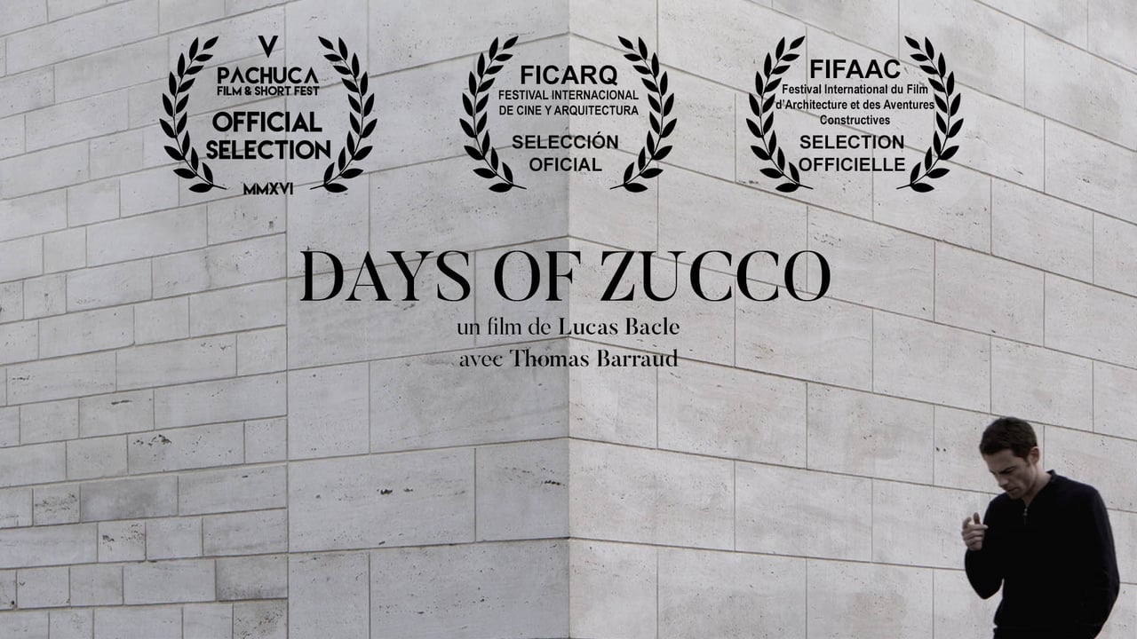
The intersection between Architecture and Film has always been a topic of interest. Movies, such as High-Rise, have looked at Architectural concepts through a Narrative. Additionally, Interiors tries to look at Cinema through Architectural Drawings. However, is it possible to somehow combine Architectural Drawings and incorporate them into a Film Narrative? That's exactly what Lucas Bacle has tried to do with his latest project, Days of Zucco

Interiors spoke with Lucas Bacle about his philosophies and his latest Architectural Short Film, Days of Zucco

INT: Can you share some information about your background? How did you start making Architectural Films?

LB: Before I started my studies at the School of Landscape and Architecture of Bordeaux, I wanted to understand how every tiny thing in this world works, but I didn't know where to start. I chose Architecture. Not because I loved it, but because I had to choose. Then I started to learn. I learned the way to create a project from the beginning (the concept) to reality (the matter). The School of Architecture didn't teach me how to build a building, but how to think critically and, at the same time, become who I am. No matter what kind of Architecture School it was, a wall was broken inside of me. As I started to shape spaces, I started to make stories, intuitively, with no other idea than to do some kind of narrative poetry and to get people interested in what I was doing. Naturally, I started to film these stories by creating short films, not always in relation to Architecture. My final year project was introduced by a 7-minute movie. This project was the first time that I succeeded in connecting Video and Architecture without being too literal. I saw that a bridge could be built. I wanted to create a connection between Film and Architecture. The jury congratulated me for this project. One of the people in the jury was interested to work with me on doing films for his own Architectural projects. He was Xavier Leibar, from the Architectural Studio Leibar&Seigneurin. He allowed my work to become professional. 

One year later, I created brumm.

Brumm is the acronym of “building research of unbuilt matter”. The second “m” does not exist really; it is connected to the other one creating “mm” which is the symbol of the bridge between architecture and cinema, which is the logo of brumm. Brumm wants to talk about life happening every day inside the "unbuilt matter".

INT: Most of your earlier works are a collection of Architectural Documentaries about various projects by Leibar & Seigneurin. Can you talk about what you were trying to accomplish with these films?

LB: I created brumm to build a connection between Architecture and Cinematography and, in the end, to build a bridge between the Architectural World and People. The future of our cities is actually in the hands of the financial system and the political world. My work is about transmitting the Architectural and Urbanism culture so that the citizen can understand the world around him/her and make it change.

Why do people not care about Architecture?

I think it’s maybe because of the Architects, who don’t help people understand what they do. They cultivate a kind of mysticism of the Architectural thought. The biggest Architects in the world work for the most powerful people and not for the masses. As an architect, I think we've made a mistake. The democratic crisis which we are in will one day give power to the people. We have to be transparent with them. This is why I did this movie.

INT: Your latest Short Film, Days of Zucco, was a project filmed at the Vertou Cultural Center and was based on the play, Roberto Zucco, by Bernard-Marie Koltès. How did this film come about and what made you want to develop this project?

LB: Days of Zucco is an experimental piece, an Architectural fiction. This is a radical short movie which tries to set a way to do this type of movie. In the same way the Director Lars Van Trier created Dogma, I wanted to build a protocol which would allow me to call my film an Architectural Fiction.

- The Scenario of the Film follows the Building, its Form and its Structure.
- There is no other Decor than the inside or the outside the Building.
- The Building and Architectural discourse are in the second narrative level.
- The human stories are the guiding theme

INT: Your film, Days of Zucco, includes several scenes where an Architectural Drawing (Site Plan, Elevation, Floor Plan and Section) is inserted to create a type of establishing shot for the audience. Where did the idea to include actual drawings of the building come from?

LB: As I tried to connect these two worlds, it was obvious for me to use Architectural Drawings in the Film. Only Engineers and Architects use them but I think they are really powerful and could be used to create stories.

Days of Zucco (2016)

INT: There is a brilliant moment in the film when the main character, Colas Jardot, is being called and a Floor Plan is shown as he’s walking towards a room. What was your thought process when deciding which drawings would be shown and where they would be placed?

LB: Since I first thought to use these drawings, I wanted to connect it to the stories of the film. I didn't want to put it somewhere just for graphical reasons. The more one enters in the narration of the movie, the more the building expresses itself with the Architectural drawing and the more one can understand it. It was really interesting to give life and scale to those, always still, drawings of a building. To be honest, I did a lot more Architectural drawings for the film than what is in the film. It was during the editing process that I chose to let people discover it piece by piece.

INT: Do you see this technique expanding? Do you have any goals in terms of work you’d like to do and projects you’d like to try?

LB: I have worked on a lot of projects since this Film and one of them is enabling me to develop these techniques. I'm doing a project for the City of Bordeaux where I am directing a short film entirely with these techniques. I want to connect the use of this technique with a real narrative and these projects allow me to do that. I'm also creating a series about Architecture. With this series, we want to do Architectural mediation by explaining how it works in our Architectural and urban world. We use humor as a medium to spread our ideas. At first it will be visible on YouTube and possibly other sites. 

On the one hand, I want to find my own art between Cinema and Architecture. On the other hand, I want to permit people to understand the way our Cities, Landscapes, Countries and World are, so that they can change it and make it look like theirs.

INTerview: Neil Kopp

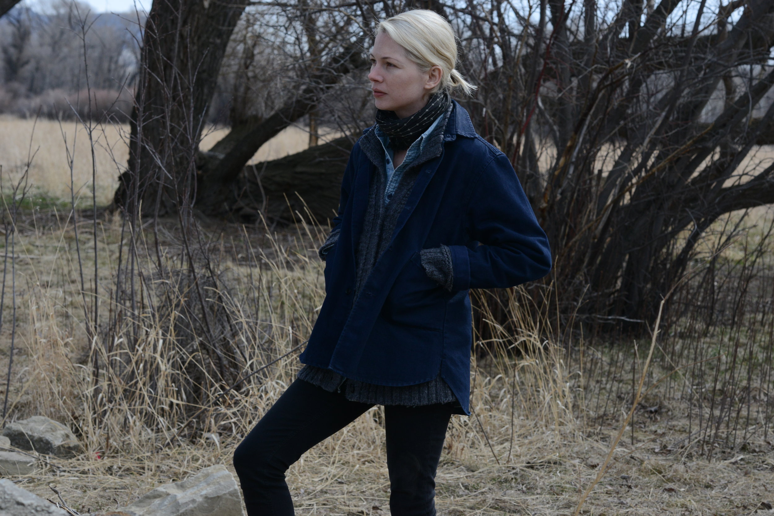
In a short amount of time, producer Neil Kopp has built quite the resume. In a decade's time, he has collaborated closely with independent filmmaker Kelly Reichardt on films such as Old Joy (2006), Wendy and Lucy (2008), Meek's Cutoff (2010), and Night Moves (2013), as well as with veteran filmmaker Gus Van Sant on Paranoid Park (2007). This year, he's had an amazing run with Jeremy Saulnier's brutal and relentless Green Room and Kelly Reichardt's latest delicate drama Certain Women, which stars Lauren Dern, Michelle Williams, and Kristen Stewart.

Interiors spoke with Neil Kopp about his career, his life in Portland, and what he does at 6am every morning.

INT: In the past few years, I've realized more and more often that every time your name comes up on the screen, it's a name that I trust. Can you talk about how you started in the industry? Did you grow up around film? What were your initial reasons for wanting to work in film?

NK: Wow. Thank you, that means a lot. I also want to acknowledge my partners at filmscience Anish Savjani and Vincent Savino here, with whom I've produced nearly everything with and could not have done without. Growing up in Portland OR, my mom was a nurse and my dad was a journalism professor at a Bible college. I didn't grow up around film at all. In fact, we didn't have a TV at all for most of my childhood and only very occasionally would we go to the movies. We were encouraged to read a lot, which we we did, and we were very involved in music as a family, both as instrumentalists but also just appreciating records and the classic bands. I played the tenor saxophone all through school - multiple band classes, plus marching band and private lessons. This was a big part of my childhood and was the source of a lot of discipline that I think I carried into my work. In the mid-late 1990s, I was in high school and I would frequent Cinema 21. I saw many of the classics there, but I distinctly remember going to a screening of Taxi Driver from a remastered 35mm print. During this time, in general, I was starting to appreciate films as a real art form instead of simple entertainment, and this screening of Taxi Driver cemented my ambitions to go into film and inspired me to seek out classes at the Northwest Film Center. I took a few night classes during my junior and senior year of high school, and it was in their equipment room that I saw a flyer on the bulletin board for Vancouver Film School. I ended up attending a one year foundation film program right after high school.

INT: What type of work did you do after film school and how did you transition into the role of a producer?

NK: I moved to Texas after film school with friends that I had made with the idea that we would make music videos for a living. I quickly realized I'd need a real job, and I ended up getting hired at a commercial production company called Big Fish Films. I was just a PA but they treated me like a Junior Producer, and threw me into the fire in a way that I only much later could really appreciate. After a few years in Texas, I moved back to Portland and ended up as a Staff Production Manager at Food Chain Films where I managed a higher volume of bigger jobs. They let me officially produce some of the smaller jobs after a year or two. These connections led me to meeting Kelly Reichardt, with whom I made my first feature film.

INT: What is a typical day of work like for you?

NK: I wake up around 6am and read for a couple of hours. I reserve this focused time for scripts or books. I then get into my e-mail inbox and the phone, where I usually stay for the rest of the day. As for the work I do, there is no typical day, but each day invariably consists of following up with people and discussing with my partners how to navigate whatever complicated situation we may be mixed up in.

INT: Do you go to the movies often? What do you watch?

NK: Not nearly as often as I'd like to, but I probably get to the theater once a month, where I try to see whatever is interesting or feels important to see on a big screen. I have a wide array of interests, and nothing is below me, meaning I love a stupid comedy or big action movie as much as I enjoy working down my "important movies to see" list at home.

INT: You've worked with a number of auteur directors, particularly Kelly Reichardt, nearly from the start of her career. What was your first meeting with her?

NK: One day in March of 2005, my phone rang, and it was Kelly calling about Old Joy. She was looking for a producer and had heard of me through a mutual friend at Wieden + Kennedy. I had just gone freelance, and so the timing could not have been better. We spoke for an hour, and I read the script and agreed to do the project that same day.

INT: I imagine you've evolved quite a bit as a producer between Old Joy and Certain Women. Do you find that the work gets easier, in some sense, or is every film a challenge in its own way?

NK: Some things do get easier, just because we're more familiar with the process, and we've developed a shorthand with Kelly which helps, but overall, it definitely isn't easier now. The stakes are higher, so the pressures to keep everything on track are pretty heavy duty, and each film has its own set of unknowns to unravel. This is what we love doing at the end of the day, and it being difficult, or even feeling impossible, is probably why we keep coming back to it. And, I don't know how to do anything else.

INT: I know you grew up in the Portland area. You've previously mentioned your familiarity with the locations in Old Joy. In the five films you've made with Kelly Reichardt, location plays such a key role. I'm interested in how much of a role you play in location scouting and how much of your background and knowledge of Oregon you bring in to the table?

NK: I do play a big role in the location scouting. However, before we ever bring on a location scout in a traditional sense, Kelly and I spend a lot of time in a car going to places we're curious about for general scouting to get the feel of a place, and ultimately to pick a zone for the production to take place in. For Wendy and Lucy and Meek's Cutoff, we scouted all over state for both films, and for the latter film, we even spent three days in/around Marfa, Texas. At the time we were concerned about Burns, Oregon (which is where we ultimately based out of for Meek's Cutoff) having enough infrastructure for the production. We were also worried because a lot of the locations we liked were over an hour from Burns. And if you're an hour from Burns, you're a really long way from anything. In the end, we made it work there, and we're happy that we did. So, Kelly and I will work together and talk about the look of a place, and then I'll go off and try to figure out if there are enough hotel rooms or something.

INT: The locations in these films are all so diverse from one another: the woods in Old Joy, the town in Wendy and Lucy; the open desert in Meek's Cutoff. I realize that as a producer you're thinking of logistical things, such as how you'll get the actors out to the locations, and how practical it is to film there. Is this something you've thought about and how your films are so grounded to the spaces and locations that they're set in?

NK: Each film has a specific look that was designed in advance, and then discovered in the world through the scouting process. There are also financial realities like travel time and housing that have to be considered. Kelly is great for a lot of reasons, but one specific way is that she's as pragmatic as she is driven by creative ideals. She's a great partner in this way.

INT: You've made a number of films in the Portland area, but your most recent film, Certain Women, was filmed in Montana. I realize Maile Meloy's short stories are set in Montana, but was that a creative decision to stay true to the setting of the stories, or a business decision?

NK: Montana was an interesting result in that it really was a happy marriage of circumstances. The stories are set there, and it was the first place we scouted (Helena and Billings), but at the time we weren't feeling it. We then proceeded to scout Idaho, Nevada, and parts of California and Oregon, before coming back to a different part of Montana - Livingston and Bozeman. This made the most sense creatively, and in terms of the business, as we were able to secure incentive funding from the Big Sky Film Grant which made shooting in the state possible.

INT: What is your favorite film?

NK: This is such a tough question and the truth is there isn't "one". The two that are important to me right now are A Man Escaped (Robert Bresson) and Heat (Michael Mann).

INT: What is the most important element to the relationship between producer and director?

The realization (on both sides) that the goal is the same but the paths required for each to arrive at the same place are very different. There is a shared experience of course at times, but it's largely a very different experience. To me, it all comes down to mutual respect and trust.

Certain Women is currently playing in theatres and is available on iTunes.

INTerview: Hanan Townshend

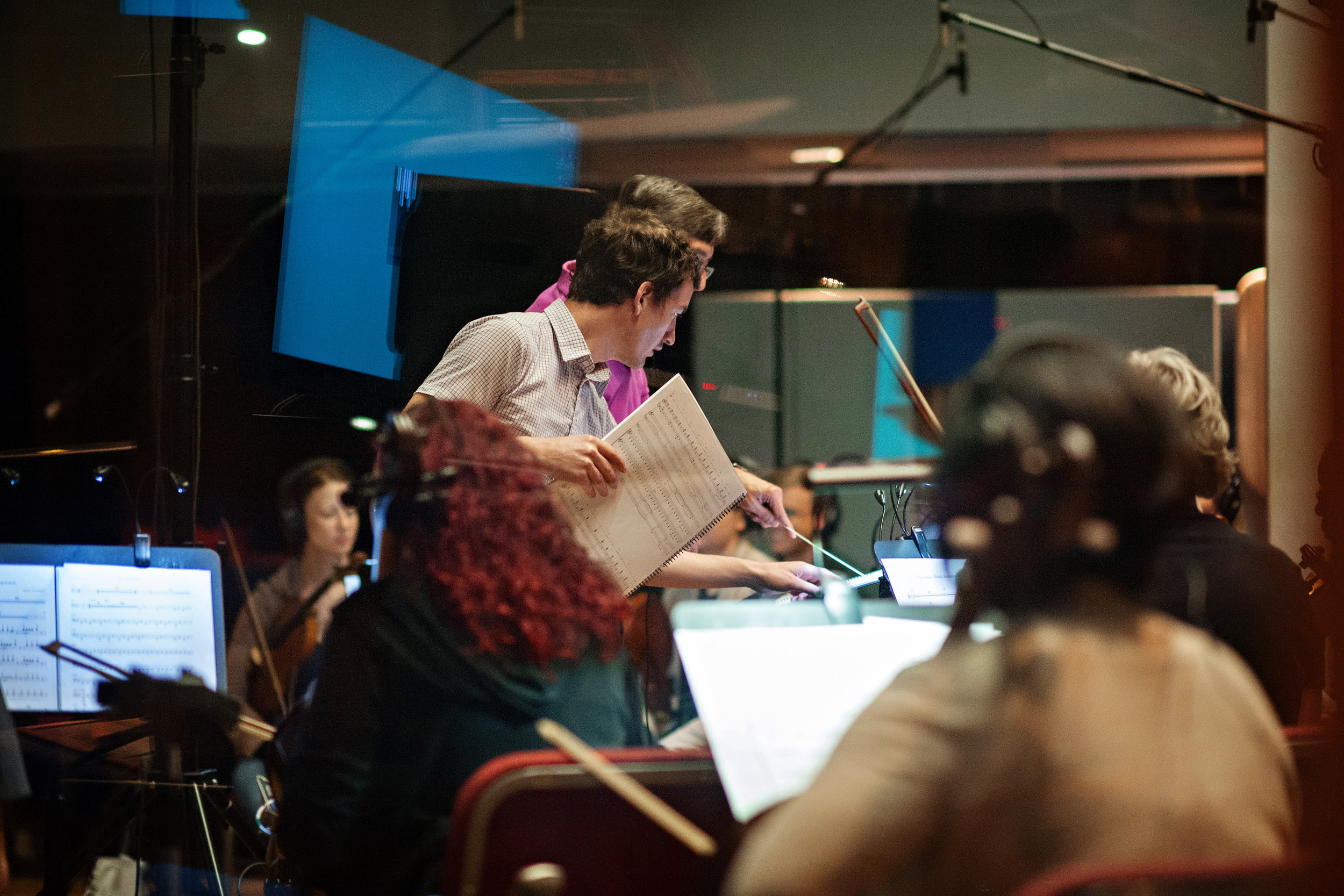
Hanan Townshend's introduction to the world of composing music for film has been quite extraordinary. This is the gentleman who received an e-mail from his college professor, asking if he'd be interested in working with an "acclaimed director" that turned out to be one of the most reclusive, poetic filmmakers, who was readying his magnum opus --  his fifth film in 38 years -- which ended up winning the Palme d'Or at the Cannes Film Festival in 2011. The film was The Tree of Life and the director was Terrance Malick.

Hanan Townshend has been collaborating with the notable filmmaker ever since, having worked on three additional films of his since then, including the latest documentary, Voyage of Time. Interiors had a chance to talk to the man responsible for composing the music for some of our favorite films of all time.

INT: Can you tell us little about yourself and your background?

HT: Certainly, I'm a Kiwi born film composer based in the U.S. I grew up on a dairy farm in New Zealand's countryside, but from an early age knew that I was better at writing music than farming. I spent any windows of time I could gather between farm jobs writing songs and recording them on my Kurzweil electric piano. In my teens, I released a few albums and performed in bands. I enjoyed the process of producing and recording in the studio and decided to study composition at the New Zealand School of Music in Wellington. In 2008, I came to the states for a year-long exchange program at the University of Texas, where I began working on films with several U.S. based directors. After completing my degree in New Zealand, I decided to return to the states to continue my pursuit of becoming a film composer.

INT: In the past few years, you’ve been working with one of the most private filmmakers. How did you come to work with Terrance Malick? What was it like first meeting him?

HT: Working with Terry was a serendipitous encounter, really. While in the states for my exchange program, I actively sought opportunities to write music for film. My professor, Bruce Pennycook, forwarded me an email saying something in the way of: “acclaimed director seeks student composer for unnamed project.” I responded quickly, sent some of my music and received a call back from producer Nicolas Gonda. I went into the editing suite a few days later and discovered that the director was Terrence Malick and the film was The Tree of Life. It was surreal, and of course I was thrilled.

INT: What was your role on The Tree of Life? How did you then go on to the To the Wonder?

HT: On The Tree of Life I contributed music to the film, which consisted mostly of simplified arrangements of Episcopal hymns. This lead me to making the trek up to Bartlesville, Oklahoma, where they were shooting To the Wonder and I asked the producers if they would allow me to come on board as the composer for the film. I worked in the editing suites in Austin, Texas and wrote music for the film nearly everyday. I believe I worked on the project full time for eight months.

INT: What is a typical day of work like for you?

HT: I'm an early riser, so I'm up by 6.30am everyday. The first thing I do is fire up my espresso machine and brew a couple of flat whites, then help get my son off to school. I usually write for six hours, unless I'm on a tight deadline. I find that's my sweet spot for my own creative bubble, any longer and I lose my artistic perspective. Outside of writing, I usually have several conference calls throughout the day. When working on a project, I'm communicate frequently with directors, agencies, and producers, so there is a lot of back-and-forth to make sure that I have what I need to give them the best experience possible.

INT: What is it like living in Austin – a city that is so well known for its music scene? Does that inspire you or influence you in any way? Do you enjoy being surrounded by that or does that not really affect you in any significant way?

HT: Truth be told, I just moved from Austin up into the Seattle area. I do miss the Austin community (especially the breakfast tacos!), but I enjoy this new phase of life in the Pacific Northwest. It feels a little closer to my home country having the mountains, lakes and oceans at your doorstep. I feel more inspired when surrounded by the beauty of the landscapes here; it definitely affects my music, too, in the best ways!

INT: What do you do when you aren’t working? What do you listen to in your free time or in the car?

HT: I love spending time with my family! We just a little baby girl in August, who is the cutest wee thing. We're also in the process of renovating a historic farmhouse, so any free time gets eaten up fixing things, painting, installing light fixture etc. Recently I've been listening to a lot of British electronica/trip hop (Bonobo is one of my favorites). I love the way they are able to mash together orchestral samples and loops from completely different genres and create a new piece of music that feels so fresh, its inspiring.

INT: Terrance Malick, as we all know, works unlike other filmmakers, in the sense that there isn’t always a concrete screenplay. How does that affect your process?

HT: My process on Terry's films is a little different from a conventional film scoring experience, because there isn't a concrete screenplay when I begin work on the film. Much of the story is crafted in the editing room. As a composer, I work within this process. Rather than writing directly to picture, I mostly compose music away from the cut. This means the music needs to be adaptable to the project but also allows for the film to be adaptable to the music. While it's not feasible for every project, I do appreciate this way of working. 

INT: What kind of director is he in terms of the discussions you guys have about the music? What are you conversations like?

HT: Each project is different, but I find we often speak less about specific moments or themes and more about the larger questions of the characters in the film, like a particular struggle or doubts, or perhaps their search for purpose. We spend a lot of time experimenting to find the right musical language for each film, I appreciate this way of working as it leads you into new and sometimes unfamiliar waters.

INT: Do you go to the movies often? What do you typically find yourself watching?

HT: Yes, when I can; although, I probably watch more TV shows than films. I really love this new wave of independent filmmakers writing and directing their own shows (House Of Cards, The Knick), I feel like we're seeing a completely fresh take on something that has perhaps in the past has become a little stagnant and predictable. I'm drawn to gritty, dark dramas.

INT: What’s your favorite film?

HT: I don't know if I can say I have a favorite. One film that I love is Darren Aronofksy's The Fountain. I didn't like the film when I first saw it in the cinema, actually, but it intrigued me so much that I ended up watching it three or four more times. As I watched it more, I fell in love with it. The film has such a unique approach, and it blends several genres together in a really beautiful way. The music for the film, composed by Clint Mansell, is absolutely incredible! Another close second is Paul Thomas Anderson's There Will Be Blood.

INT: Voyage of Time is your first documentary with Terrance Malick. Is there a difference between working on a documentary with him instead of a narrative feature film?

HT: Contributing music to the Voyage Of Time films was very similar to all the experiences I've had working with Terry. In many ways I feel like all of his films are more like documentaries in nature, with their freedom from a concrete screenplay and identifiable experiences and personalities between audience and characters.

Voyage of Time is scheduled for release on October 7, 2016.