INTerview: Daniel Rich

It is hard not to get transfixed on the Art of Daniel Rich. Amazing, Intricate, Architectural works of Art that tell a story. His work looks at political and social narratives transcribed in the built environment. Whether it's political power structures, failed utopias, or politics, Daniel Rich has managed to create Art that is multifaceted and meaningful. 

In an exclusive interview with Interiors, we talked to Daniel Rich about his art and his inspirations. All images are courtesy of the Artist and Peter Blum Gallery

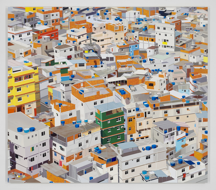
Favela, Rio de Janeiro, 2014. 

Favela, Rio de Janeiro, 2014. 

INT: Your work is very much influenced by Architecture and the Built Environment. Has this always been a source of inspiration for you? Or did that develop over time?

DR: I grew up in Southern Germany towards the end of the Cold War and I distinctly remember watching the fall of the Berlin Wall on television. The events surrounding the collapse of East Germany and the Soviet Union really caught my attention at the time- I was only 12, but I realized there had been a seismic shift in the country’s political and social reality. In retrospect, these events had a profound impact on my perception of the world and made me aware of historical legacies and symbolism inscribed in the built environment around me.

I did not seriously set out to become an artist until I was 20 years old and when it came to subject matter, I automatically turned to architecture and history. My early work during my undergraduate studies revolved around the passing of time as it related to place. It was very nostalgic and I was heavily influenced by skateboarding and graffiti culture, which gave me a different kind of appreciation and awareness for the built environment.

I was in my second week of graduate school on September 11th and happened to be struggling with conceptual and aesthetic aspects of my work. My painting was heavily reliant on geometric abstraction and the events on and after September 11th directed me towards painting architecture more realistically. During this time I began appropriating photographs found in the news media and online in response to radio and TV broadcasts, and through research and reading. I realized that pictorial architecture allowed me to introduce a dialogue about changing political power structures, (failed) utopias, the impacts of ideological struggles, war and natural upheavals.

Hong Kong, 2013. 

INT: You mention on your Website that your work calls “attention to implicit political and social narratives transcribed in the built environment”. Can you talk about this process? Does it start as an idea and then transform into the image? Or do you see the image first and start to build the meaning and symbolism? Can you give us an example of the process for a particular painting?

DR: I always work from photographs and my ideas for paintings most often occur with a specific event that I read or hear about in media coverage. A painting that is a good example is “Obama’s Visit to Baghdad” from 2008.  The painting is based on a photograph that appeared on the cover of the New York Times in 2008 of then presidential candidate Obama and General Petraeus looking out of a helicopter window while flying over Sadr City in Baghdad.

The photograph read to me like a staged election campaign photo. I wanted to shift the focus and narrative of the image to the view out of the window. What appealed to me about cropping the image and the resulting composition, was the concept of painting as a window and the potential divergence and duality of the image.

Guangzhou Circle, China, 2015.

Obama's Visit to Baghdad, 2008. 

INT: The topics of your work range from a large urban cityscape to an architectural detail. Is there a particular topic that you enjoy creating more than another? Or is there a particular symbolism that you enjoy examining?

DR: I like “mixing things up” in my work and try to always expand my range of subjects- architectural façades like the strip mall in Dubai, the “Large Hadron Collider”, iconic buildings such as the “Guangzhou Circle” or the “Torre Velasca” in Milan, interiors such as the “Pyongyang Ice Rink” or “Dreilinden”, Favelas in Rio de Janeiro or urban density of Hong Kong… What matters to me is the potential of the image to convey or reflect layers of meaning to the viewer.

Choosing source material is a very intuitive process and there is a certain excitement I feel when I find an image that guides me towards the making of a new piece. Mediating the image from a photograph into a painting is a process of editing, de- and reconstructing the image and working with color.

I don’t have a preference for one subject over another- it mostly depends on what I am thinking about or what is happening in the world on any given day. I see my role as an artist to distill certain moments in time by making paintings that reference or reflect on specific political, economic and social conditions and circumstances as they occur. I have come to see my paintings as portraits- I just choose to paint the built environment instead of people.

Pyongyang Ice Rink, 2015. 

Dreilinden, 2010. 

Sheikh Zayed Road, Dubai, 2016. 

INT: You describe your interest in the “potential divergence and duality of images” and I’m curious if you’ve ever thought about experimenting with depicting film locations or scenes in your work?

DR: I think my work has a certain cinematic quality- the viewer is always alone in the painting as I do not include the human figure and this has the potential to turn him or her into the subject of the painting. I think I am very influenced by film as I “consume” more of the genre than other art.

I enjoy the uncanny and mysteriousness in the images I create. I love Alfred Hitchcock’s films, especially “North by Northwest” and “Vertigo”, Werner Herzog’s “Lessons of Darkness”, Kassovitz’s “La Haine” and Orson Wells’ “Citizen Kane”. What has always drawn me to painting architectural subjects is the idea that architecture is the backdrop to human events. It would be interesting to investigate theatrical backdrops, movie sets and film locations as subjects for paintings.

CERN (Large Hadron Collider), 2014. 

INT: Your work is so captivating and seems to tell a story. It’s incredible how you are able to blend Art, Architecture, Symbolism and Politics in such a beautiful way. Where do you see your art going? Do you have any goals in terms of work you’d like to do and projects you’d like to try? 

DR: I have been thinking more and more about working with series of images- making different versions of the same image and adjusting the light in the paintings for example. I think there is a lot of potential for creating narratives through the manipulation of color such as working with monochrome or subtle color palettes. I would also like to scale my work up to murals and approach mural and exhibition locations as site-specific installations.

I have been creating more of my own source material for paintings recently and could see myself branching out to photography or documentary film making in the future. For now, I am content with my practice but I think it’s important to always challenge the way you see and approach your work so you can develop new ideas and don’t allow things to stagnate. 

INTerview: Chris Trujillo (Stranger Things)

The Netflix Original Series, Stranger Things, has taken over the Summer of 2016. The show, which tracks the disappearance of a young boy and his paranormal whereabouts, was an instant hit when it debuted and hasn’t looked back since.

Created by The Duffer Brothers (Matt Duffer and Ross Duffer), the show has incredible visual references from classic films like E.T., Close Encounters of the Third Kind and The Goonies, to name a few. Yet, it still feels fresh, unique and completely original which is a testament to the incredible cast, writing and production design.

In an exclusive interview with Interiors, we spoke with Chris Trujillo, who is the Production Designer for Stranger Things. The architectural drawings are property of Chris Trujillo and his team. 

INT: First off, we were curious how the opportunity to do the show, Stranger Things, came about? What was it about it that made you want to work on it?

CT: A series of very fortunate events led me to Stranger Things. In the Spring of 2013, I designed a dark little gem of a genre film called Honeymoon for Leigh Janiak. She and I really jived creatively and became fast friends in real life. We kept in touch, and then, in the summer of 2014, I was in Los Angeles for a few months designing a film and staying in an Airbnb around the corner from where Leigh and her then fiance, now husband, Ross Duffer live in Los Feliz. The first time I heard of Stranger Things was over brunch with Leigh and Ross. At that point, the project was still called Montauk and it was little more than a glimmer in the Duffers' eye. It seemed like too awesome an idea, like a perfect pipe dream. I'm a child of the 80s American Suburbs, and, as a production designer, I'm a student of the great American films of the late 70s and early 80s. So once we started throwing around influences like Mike Nichols, David Lynch, and Ken Russell in the same context as Steven Spielberg, Stephen King, and John Carpenter, I knew this was a dream project for me. We talked excitedly about it for a bit, I made them promise to remember me if ever the stars aligned, and then we moved on to other topics.

Over the next year said stars did align more quickly than anyone could have predicted as the Duffers made their bones with Hidden and Wayward Pines and then, through sheer perseverance, found producers with the vision to take a shot on this awesome idea. Like the genuinely loyal guys that they are, and, no doubt, on account of a little cheerleading from Leigh, they didn't forget about me and my enthusiasm for the project. As soon as they got in touch, I got to work putting together a lengthy lookbook to give them a broad strokes idea of how I envisioned the look, tone, and texture of the show. Turned out we were on exactly the same page creatively. The final piece to the serendipitous puzzle was the fact that when they contacted me about Stranger Things, I had just finished designing Nerve, a super slick, smart teen thriller produced by Lionsgate and directed by Henry Joost and Ariel Shulman, another pair of fantastic directors that I've been lucky enough to work with twice. Nerve was the first "big budget" film I had designed, and, without the blessing of it's executive producer extraordinaire, Alli Shearmur, I don't know if I would have passed Netflix's vetting process. In the end, it all came together, and Netflix gave us the time, resources, and creative freedom to make the seemingly too-good-to-be-possible pipe dream come true.

INT: The show has a very distinct tone and serves almost like an homage to the Cinema of the Eighties. Did you do a lot of research into movies from that time? Also, were there any challenges along the way with trying to create something authentic from that era?

CT: The cinema of the the 80s was already pretty well imprinted on my subconscious from my having grown up transfixed by it, but, yeah, I spent some very enjoyable hours revisiting the touchstone films of the era as well as some of the deeper cuts that your average movie fan might not be hip to, like The China Syndrome, Altered States, or Ordinary People. It was incredibly useful creatively to immerse myself in the tone, texture, and pace of those films because there's something essential about them that can't really be intellectualized but rather needs to be arrived at intuitively by going into "the bath," so to speak. Additionally, I spent a lot of time pouring over the media of the era: everything from lifestyle magazines and newspapers to comic books and Sears catalogs. 

The greatest challenge is always arriving at the the right level of "lived in." My good friend and incredible set decorator, Jess Royal, is unbelievably exacting in her approach to period correctness, and it is primarily important to us that our sets inform the characters and reflect the era down to the subtlest details. It's easy to pick a wallpaper or curtains that just scream 1980s! and ultimately, it can be very distracting to an audience. So we start with the characters, who they are emotionally, culturally, socioeconomically, and we figure out how all of these factors would have been expressed in the context of the trappings of American life in the late 70s and early 80s. One of the secrets (Jess may kill me for revealing it to the uninitiated) to creating the ever important "life layer" on a set is fastidious estate sale pillaging. Every weekend in the suburbs outside big cities there are time capsules being opened up for the discerning decorator to dig through. One dead man's junk drawer is another man's period perfect set dressing. 

Stranger Things (2016)

INT: The show was filmed outside of Atlanta in small towns like Douglasville, Jackson and Stockbridge. Was there a particular style or aesthetic that drew you to certain locations or buildings? 

CT: Before deciding on Atlanta as our filming location, we were beset by the slightly overwhelming options of an open map. We talked about and explored everywhere from New England to coastal Carolina, from sunburnt Texas to the Pacific Northwest, but then it occurred to us that the world we wanted to create should be ubiquitous, instantly familiar to everyone; Anytown, USA. Suddenly, Atlanta was an obvious choice. It served us so well because Atlanta proper and the various towns that surround it really represent a broad spectrum of archetypal Americana. There are all of these incredible neighborhoods, that, with very little modification, perfectly paint the picture of split-level ranch-style suburbia, born in the 60s, that came to define the look of 70s and 80s American life. So, we get rid of the DirecTV dishes, manicure the lawns, switch out a few mailboxes, fill the driveways with period correct station wagons and sedans and voila! You're ready to travel back in time with some misfit middle schoolers on BMX bikes. 

That's not to say that Tony Holley, our intrepid location manager, and I didn't spend countless hours scouting every inch of the greater Atlanta area for the perfect locations. We definitely did. That's maybe the best part of shooting in an area as big and varied as Atlanta. There are so many interesting options that we were really able to cherry pick the best looking, most dynamic locations to build our world: a quaint downtown here, a creaky country home over there, oh and maybe that imposing brutalist experimental psychiatric facility too, all the while bearing in mind the importance of all of these often far-flung locations coming together and feeling of a piece on screen. It's a big task made manageable by shooting in the right part of the country. 

Stranger Things (2016)

INT: Will Byers’ house goes through a transformation during the show and has an important role throughout the series. What was the process like trying to design that particular space? Was it challenging knowing that aspects of the space would be changing? Also, did any decisions involving the space revolutionize as production began?

CT: Maybe the most gratifying thing for me as a production designer is when a set transcends the scenery and becomes a character in its own right. From the earliest outlines of the story, it was clear that the Beyer house was going to have its own, very intense, trajectory. The first step in bringing it to life was finding an outstanding practical exterior location. When we found the Beyer house exterior there was no question in anyone's mind that it was exactly what we were looking for: a ramshackle old house built between the wars, clad in grey-blue faux-wood asbestos siding, across the tracks, at the end of a grim gravel drive, pressed up against the woods on the far edge of town. Before you get through the front door you start to know who the Beyers are and maybe what Will has been through. 

Beyers Home Floor Plan

As is the case with all of our built interiors, I let the practical exterior determine the basic elements of the interior: placement of windows and exterior doors, rough dimensions, and building materials. From there, the script starts to determine the floorpan. With input from the directors and the cinematographer and with the scripted action in mind, I lay out the interior in a way that allows for the most unencumbered camera movement and interesting framing options, with particular attention paid to depth and the way each room connects to the next. With the Beyer house there was the added fun of building to accommodate an invading monster and a mother with an axe and christmas lights, coming unhinged, tearing the place apart in an attempt to communicate with her son trapped in another dimension. Also, we had to do a version of it completely covered in the membranous tentacles and slime of the Upside Down. The lynchpin to pulling all of this off in one set (we did build a duplicate of the hallway to set on fire) was an Art Department friendly schedule that kept us shooting in script order as much as possible, which our exceptional AD department did their best to ensure. Murphy's law, nevertheless, occasionally intervened, and there were a number of times we had to start the day shooting the living room in a totally wrecked state and then completely un-wreck it for the second half of the day's work. For the relentless graffiti and axe attacks and monster wall breachings, we predetermined which walls would get it the worst and we built them to be removable and replaceable with specially fabricated walls rigged for the various practical special effects we executed. One of my favorite replacement walls was made by printing our wallpaper pattern directly on sheets of latex. I'm starting to run on here, but I'd be remiss not to acknowledge the heroic acts of interdepartmental collaboration that went into making the cacophony of christmas lights behave the way we wanted them to on command. To make them "communicate" with Joyce, lead Holly down the hall, and freakout so beautifully, set dec, props, and a handful of very patient grips and electricians had to work harmoniously and at great length together! OK, next question.

Stranger Things (2016)

INT: Hawkins Laboratory is another incredible space on the show. We see Hopper break into the rooms of the building as well as flashbacks of the facility, but the space is always somewhat of a mystery to the audience. Is this something that was intentional?

CT: It was important that Hawkins Laboratory feel like an imposing, threatening entity looming secretly in your backyard. In that way, it works as a physical reflection of the Reagan Era, residual Red Scare, Cold War anxiety that's lying just under the surface in Hawkins, Indiana. I wanted the main experimental space with "the bath" in it to feel as though it was purposely built in the early years of the cold war as a highly secure, top secret government facility, and that it has probably been modified over the years to accommodate whatever fringe science psychic weapon they're working on at the moment. In designing and building the underground elevator and corridors, we took inspiration from our practical location.

Hawkins Lab Floor Plan

Stranger Things (2016)

Isolation Tank Drawings

Historically the building we shot as the exterior Lab was an experimental psychiatric facility, effectively a mid-century "insane asylum", complete with these terrifying, long, low, stark white, underground corridors that linked the main building to what once were patients' quarters. Above ground in the main building there were a number of incredible, very institutional, dark wood hallways, and a massive tiled half-basement space that seems to have once been, at least partly, a cold storage facility. We were able to retrofit and elaborate that space into what became the rooms and hallways that eleven lives and suffers in at the hands of Doctor Brenner and the insidious Department of Energy. 

Hawkins Lab Elevation

INT: The concept of “The Upside Down” is presented halfway through the series and we start to see this alternate dimension. The Production Design for this universe is exceptional because it perfectly balances the line between reality and fiction. Was it difficult trying to create this balance? Were there different concepts of The Upside Down that were discussed as well?

CT: Dialing in a vision for the Upside Down (which we referred to as "the Nether" while conceptualizing it) was possibly the most creatively laborious and painstaking collaboration of the entire season. It was an object lesson in how tricky the alchemy of turning a shared fantasy into a physical set can be. It's funny because, from the beginning, everyone had a very clear sense of what the Upside Down should look and feel like and we could discuss it fairly clearly: like a dim, sick reflection of our world, murky darkness, a haze of "spores" floating in the gloom, vein-like vines overtaking all surfaces, like a disease is spreading over everything, etc, etc. The Duffers even created a lengthy thoughtful document that does a damn good job of making strange sense of what the Upside Down is and how and why it came into existence, even a sort of physics that applies to it, but fabricating it was not so straightforward. From the outset, it was our intention to be as true as we could to the practical special effects that rose to the level of an art form during the era of film making we were so reverently trying to honor with Stranger Things.

We all learned a lot about the advantages and limitations of that approach and gained a massive new appreciation for both practical effects artists and visual effects artists in the process. Ultimately, we arrived at the Upside Down we all now know and love and fear through a lot of trial-and-error team work between physical effects and visual effects, with a large helping of creative construction, incredible scenic work,  inspired lighting design and consummate camera work. The really magical part of creating the Upside Down, which actually works pretty well to sum up the entire film making process on Stranger Things, is that after all the logistical ups and downs, all the creative ins and outs, and after passing through a thousand different contributing hands, the world we found ourselves watching at the end of the process is exactly what we all hoped it would be.   

Chris Trujillo is a Production Designer and has worked on various Films, Television Shows, Music Videos and Commercials. You can visit his Website to see more of his work. 

INTerview: John Joyce (Anomalisa)

The stop-motion film, Anomalisa (2015), is a story with one location. Except for an airplane, a taxi, a sex shop and a family home, the story mostly focuses on the main character, Michael Stone, as he travels to the Fregoli Hotel for a business trip. It is in this hotel that we see somewhat of a mid-life crisis involving a man that doesn't seem to be able to make any social connections with anyone.

What makes Anomalisa, written and directed by Charlie Kaufman, so fascinating is its humanistic quality. Everything from the puppet's mannerisms and movements to the miniature locations make the film come alive. These exquisite architectural sets only enhance the human-like mood that the film portrays.

In an exclusive interview with Interiors, we spoke with John Joyce, who is the Production Designer for Anomalisa. The images and floor plans are property of John Joyce and his team.    

Anomalisa (2015)

Anomalisa (2015)

INT: We realize Anomalisa is your first feature film. Can you share some information about your background?

JJ: I come from a fine arts background.  Both my parents are artists and when I showed an interest in it at a young age they started teaching me the fundamentals.  As I got older my drawings became more dimensional and they encouraged me to try sculpture.  This was a thrilling discovery to then have something I drew be a tangible object.  While in college at Pratt institute I explored ephemeral art, earth art, and installation art.  I enjoyed the topic of how viewers had to view and interact with the work I was creating, which led me to kinetic art.  Conceptually I was trying to tell a story though and I found it to be a constant struggle trying to imbue all the ideas I was trying convey into a single piece of work.  So I decided to try writing and illustrating children's books.  To earn a living I worked as a designer and prototype fabricator, creating lighting, furniture, toys and games. Kids books were fun but they still only represented a series of illustrations of a story and lacked that tangibility that I craved. Growing up in the 80’s I loved films that used puppetry and stop motion animation.  So I decided to go to graduate school at Calarts and study animation.  Stop motion filmmaking was what I had been searching for.  It combined everything from storytelling, design, tangible art, and movement, all into one medium.  It’s an amazing niche of film to work in that requires the collaborative effort of dozens of highly specialized artists.  With animation anything you can imagine is possible, and every project presents us with new challenges to figure out.  We make every commercial, TV show and film one frame at a time and have visual control over each and every one.  Artistically it's extremely rewarding!

INT: How did the opportunity to work on this film come about?

JJ: Stop motion animation is a very specialized form of filmmaking. Everybody who works in the medium knows one another and we travel like gypsies from one studio for a production to the next.  I had worked in the art department on the tail end of Mary Shelly’s Frankenhole years ago.   Starburns Industries was a newly formed studio at the time and it was one of their first productions. Director Duke Johnson and producer Rosa Tran liked my work and invited me back to do production design on their next show Beforel Orel.  We all had such a great collaborative work experience, that when they asked me to come back to do a Charlie Kaufman animated film, I jumped at the opportunity.  I'd like to add that the initial funding for Anomalisa was generated through a Kickstarter campaign. Starburns Industries really wanted to create a film that they would have total control over without any outside major studio influence.  The fact that the filmmakers involved would have complete creative freedom was another huge incentive for signing on to the project.  Kickstarter backers were invited to tour the studio throughout the course of production.  It was a challenging film to make for all involved, and seeing the excitement of these Kickstarter backers about the project during their visit was really what kept us all going.  Whether they were fans of Kaufman or stop motion or both, on a weekly basis we got to meet the people who wanted to see this film get made and their enthusiasium for Anomalisa was very inspiring.

Michael's Hotel Room Floor Plan

INT: Can you talk about working with directors Charlie Kaufman and Duke Johnson?

JJ: They were great to work with. Not only are they both strong visual artists, they both are clear and concise when it came to their vision of what the film was.  We spent a lot of time early on putting together an inspiration board. It included all kinds of photos and notes that really set the mood for the type of film we visually wanted to create.  We also discussed aspects of a lot of films that we liked for a variety of different reasons, which in turn led to a long list of things we wanted to explore in Anomalisa. It really gave me a clear and cohesive understanding of how they envisioned the story as well as the overall film.

INT: In the beginning of the film, there is a 14-minute scene that takes place almost entirely in Michael's hotel room. Were Michael's actions choreographed within the space in any way? How were you able to create such a dynamic space for the entire film? Was it constructed in such a way that the camera could be placed anywhere in the space?

JJ: It was very much so choreographed. Storyboards were turned into an edited animatic, which is basically a rough 2d version of the film in its entirety.  In addition Duke Johnson and the animators recorded tons of live action video reference of various scenes.  This allowed the animators to study the movements and have a clear understanding of the their shots.  Before every shot the animator did what's called a pop through.  It’s a rough positioning of all the key poses and placements of the character throughout the shot.  This allows the animator to address issues of puppet access and performance, as well to test out any camera moves and make necessary adjustments before the real shot.

To accommodate for the large number of hotel room shots in the film we constructed eight identical fully realized sets.  All of them were modular to allow for the various camera angles we needed.  Three of them had additional mechanics built in for specific shots that entailed elaborate motion control camera moves throughout the space.  I feel that what allowed us to achieve a dynamic feel in the film was approaching it from a live action sensibility, however we knew going in to it that certain techniques of live action filmmaking aren't conducive to stop motion filmmaking.  Long shots are incredibly difficult to pull off in stop motion.  The materials we construct the puppets and sets out of expand and contract depending on the temperature.  Film lights dim and get brighter over the course of the shot.  Gravity affects the motion control camera move and can create slight changes in position or focus. All of these things needed to be tweaked on a daily basis over the course of the shot to maintain consistency. In live action you can get one minute of footage after filming for one minute. In stop motion it might take you a months to animate one minute of footage and a lot of factors can change in that amount of time.       

Toy Store Concept Art

INT: Is the Fregoli Hotel inspired by any hotel, specifically, or was it supposed to be a generic space?

JJ: It wasn’t important to Charlie that we create an exact replica of Cincinnati, to him it was just where he happened to base the story.  While we wanted it to have a Midwest feel, we took a lot of liberties.  Since it is animation and everything is fabricated from scratch we decided it was more important to create a city that fit the lead character’s perception of the world.  So yes, all the locations including the Fregoli hotel are generic. They are an amalgamation of lots of online research as well as numerous field trips to similar locations.  Interior design like everything else has trends that become popular and are rapidly copied everywhere, so we studied the types of building materials and design features that were common in 2005.  We cobbled together all the glaring similarities from the stone tile walls to the emotionless close up photographs of architectural details that hang on the walls to construct a look for the Fregoli Hotel that is familiar yet universal to that time period.

INT: What was the most challenging aspect about designing and building the scaled-down sets?

JJ: Honestly I'd have to say that designing and building the sets was the fun part.  The challenging aspect was all the preplanning that entailed how we were going to physically and technically accomplish the shots. The stop motion movie magic is all the stuff the camera doesn't see.  While the sets are scaled down, the overhead lighting grids, cameras, motion control camera units and animators are not. In other words you have to cram an enormous amount of stuff around these miniature sets and puppets, all the while keeping in mind that they need to be accessible. With each shot we were presented with new challenges.  Take for instance the hallway shots where the camera follows the characters down the 16 inch wide by 30 foot long set.  The camera was aimed directly down the hallway showing the floor as well as the walls on both the left and right side. A programmable camera mover whose track ran along side the length of the set suspended the camera above the hallway floor, and above that was the lighting grid. This meant that in order for the animator to access the puppets every wall section of the set needed to be independently hinged to open and close repeatedly for every frame as the puppets walked down the hall. On top of that the walls had to lock exactly back into place or else during the animation it would look like an earthquake was happening over the course the shot. Another example is the continuous shot where Michael walks from the hotel lobby to the elevator, down the hall, into his room, and finally into the bathroom before cutting. We spent about half a year planning and setting up the shot and close to a full year animating it. The lobby had to be built in a way that elements of the floor could be deconstructed as the animator progressed through the set. The characters then make their way into the elevator. The elevator set was designed to break away from the lobby set with all of the overhead lighting and camera attached to it and was wheeled onto another stage and connected to the hallway and hotel room set where the shot continued. It was extremely nerve racking. Remember, everything is miniature and we are animating it frame by frame, so even the most minute shifts in the lighting or camera could jeopardize the entire shot. 

Michael's House 

INT: The film has been described as being "atmospheric" with backgrounds not always fully visible. Did this make certain sets and spaces easier to design because you could focus on what was most important?

JJ: Hmmm, yes and no. Working in a film medium where every thing you see on screen is completely fabricated in miniature scale, sometimes makes it harder to hint at something rather than just create it in its entirety. The types of locations we shot are made up of so many seemingly insignificant details that normally are in our periphery but are what help define a place’s atmosphere, such as signage, art on the walls, or light sconces.  In other words I feel both the primary focus as well as the elements we choose to render in a more atmospheric way needed to have those key visual details to create that subconscious sense of believability.  Honestly, when I initially signed on to the project I thought dear lord its one realistic mundane location after another, this is going to be incredibly boring to design. But once I listened to the original radio play and saw the animatic I knew I was presented with a unique stop motion opportunity. We wanted to incorporate enough detail into the sets that they would be perceived to have a sense of realism, but more importantly we wanted viewers to feel the environments. We’ve all been to these types of locations and can relate to the feelings they create and the toll they take on you mentally and psychically.  It's exhausting dealing with security lines, pressurized airplane cabins, layovers, jet lag, hotels that at first seem luxurious, but quickly leave you longing for you own home, all within a city you don't know.  So the environments where meant to parallel Michael’s story and his perception of the mundanity of life.  He travels place to place in his own little bubble; his world is only defined within his personal space and the daily human interactions he has to deal with.  He’s so caught up in himself, his problems, and his delusion that everything outside his bubble falls off into an unobtainable abstract world. And sadly enough, perhaps this is where his salvation lies.

John Joyce is a Production Designer and has worked on various Films and Television Shows. You can visit his Vimeo to see more of his work. 

INTerview: Ethan Tobman (Room)

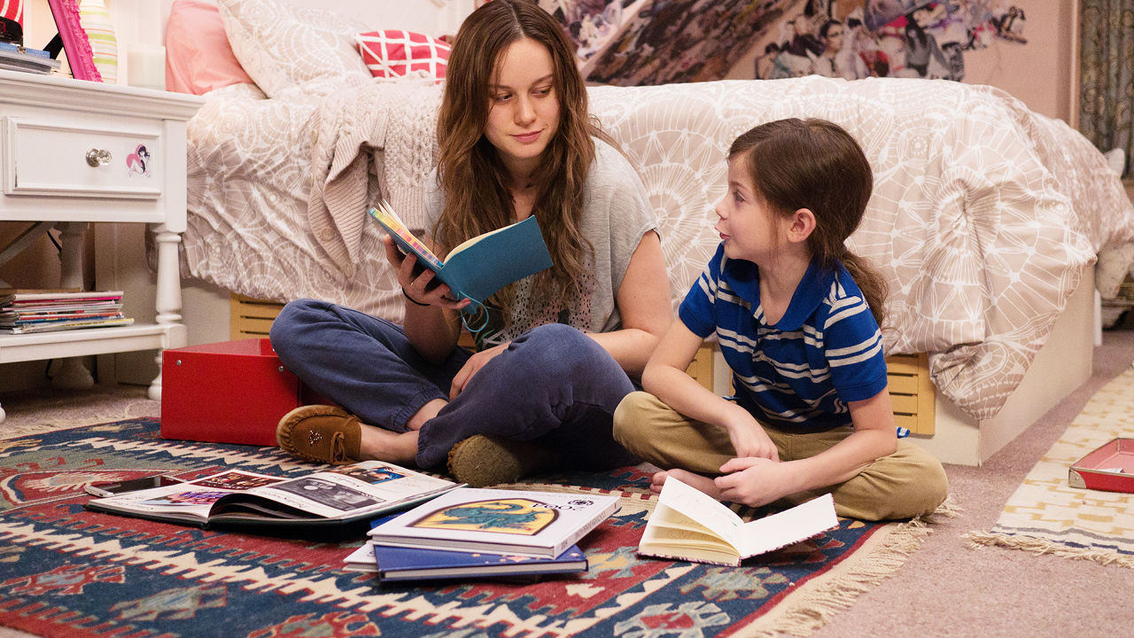
Room (2015), directed by Lenny Abrahamson, captivated audiences with its honest portrayal of Joy Newsome, a 24-year-old woman that is held captive for 7 years with the son she conceived with her kidnapper. Joy, who is played by Academy Award Winner, Brie Larson, tries to create a new world with her son, Jack, in this 10 x 10 foot-space.

Normally, a space like this would be incredibly challenging to create and shoot, but Ethan Tobman, the film's Production Designer, was able to masterfully build a dynamic space that felt interesting and warm on screen. Additionally, Tobman and his team constructed the room in such a way that allowed the Director unprecedented access.  

In an exclusive interview with Interiors, we spoke with Ethan Tobman, who is the Production Designer for Room. The images and floor plans are property of Ethan Tobman and his team.    

INT: We have heard you talk about the space of "Room" as an "inverted Rubik's Cube", where the floors, walls, and ceiling could all be removable. Was it always the idea that the room would be constructed in this way or did that change over time?

ET: While interviewing for “Room,” I was designing a fairly intricate job requiring math and pre-visualization: OK-Go’s “The Writing’s on the Wall.” So I approached the constraints as a riddle to be solved through geometry. How do you get 70 people on a film crew to fit in a space made for 2? I felt the answer was that you wouldn’t, but rather, I approached the set- as I mentioned before- as an inverted Rubik’s Cube: where every panel and every square could be removed from the outside, allowing us to peer in. This proved helpful both for the intimacy of performances and restricted us to create a very naturalistic environment.

INT: We have heard that the production stuck with the rule that every shot in the film should be achievable within the space itself. That's something that interests us a great deal, because you're being true to the space. How closely was this followed? Do you know of any instances where the team cheated the space in any way?

ET: Both director, Lenny Abrahamson, and cinematographer, Danny Cohen, were adamant about maintaining physical naturalism by avoiding the breaking of a 4th wall on camera. To that end, I’ve always been taught as a designer that your best work comes when you’re given a box to think outside of. Without restrictions, an artist is sometimes given too big a canvas to refine their brush strokes. As a result, we embraced the constrictions of our characters’ confinement within their literal physical space.

Even when the body of the camera was outside of room, the lens was purposefully inside it. Because of this, there is a real intimacy to the performances; we essentially made a movie peering into their environment.

Room Rendering

Room Rendering

Room Overhead Rendering

INT: What were some of the questions you had in mind after reading the script in terms of spaces and locations? What were some of your biggest concerns?

ET: I think all of our collective concerns as a creative team were in maintaining audience interest in one small space for over and hour. We would later laugh at this false instinct, and feel we weren’t given enough time to explore the chasms of history, and the nooks and details of their love within the confinement.

Due to the restriction of a minor’s hours on set, we found ourselves with time to kill; we shot an entire movie’s worth of inserts and still-life studies of objects in their confinement, and never felt we had repeated ourselves.

The thing about a world told from a child’s perspective is that each corner is a planet in a solar system. There are interiors within interiors. And so the space is essentially endless.

Room (2015)

INT: We've seen you say that one of the challenges you had was designing the exterior of "Room." It's interesting that Joy and Jack's "prison" is essentially an average shed in the backyard of an average home in an average neighborhood. In this sense, you're creating an entire world that has a seven year history in a space that exists onto itself. Can you speak about that?

ET: This was the most unexpectedly satisfying part of the creative process on “Room.” I focused obsessively on the interior without ever once considering the exterior, because Jack, likewise, had no sense of it. Once we had agreed upon the warmth, and richness, and layered life inside, I realized it was important to me to create an exterior that was entirely innocuous.

There is nothing special about Room from the outside; only Jack and Ma make it special on the inside. The horror of their confinement, and the richness of their bond, transcended the interior. When I presented it to Lenny, Danny and Brie, they were absolutely shocked. How could such a muted, small exterior capture so much life within it?-- That was precisely the reaction I wanted the audience to have.

Room (2015)

INT: In "Room," many of the items offer insight to the characters of Joy and Jack. Were there any items that were important to the characters that the audience may have missed? What were some items that made the space come alive?

ET: What’s important here in adapting a known piece of fiction is to add a layer of intelligence and heart to it, without detracting from its existing resonance.

We started imaginably, with drawings and games, and moved into more utilitarian objects that speak to a confinement’s function. Some of my favorite objects that never made it to screen were a deck of cards, hand-drawn on many different scraps of paper, grocery bags, and fabric. Also, a hole beneath the bed, that spoke to ma’s attempt to escape with a dull spoon. And finally, a schedule of every channel’s programming on TV that Jack would have spent years conceptualizing.

Room (2015)

INT: One of the most interesting aspects of the film is the way the story shifts once Joy and Jack have escaped from "Room". Somehow, the outside world feels more cold and scary than inside the "Room" for the two characters. How were you able to achieve that?

ET: What first attracted me to the project was the irony implicit in liberating prisoners only to introduce them to a very different sort of confinement. As a designer, my instinct was to approach this counter-intuitively. So, Room is a place that is warm. It is personal, it is layered, it is safe. Outside Room, the world is cold, impersonal, antiseptic, unsafe. I made some very conscious choices to introduce materials Jack would find disarmingly foreign, such as mottled glass, convex mirrors, plexi-glass, motion-sensor light-switches, cell phones, stainless steel, perforated ceiling tiles, condensation on windows.

For a young boy, experiencing these things for the first time, something innocuous to us would appear positively spellbinding to him. But what’s interesting about Jack is that he’s young enough that it will just as quickly become commonplace.

So, as a designer on this film, I found myself scouting locations and drawing sets outside of room with a mix of Jack’s indelible innocence and Ma’s quiet trauma.

Room (2015)

INT: Some of our favorite moments in the film are the interior shots of the hospital and Joy's parents' house. Did the architecture of this space dictate any decisions involving certain scenes or sequences?

ET: Very much so. We purposefully chose a Danish modern house with a particularly brutal bannister, employed wood-paneling and linear wallpaper, and shot these scenes framed as boxes within boxes. We were always cognizant of treating our liberated prisoners as inmates in a new prison. Lenny once said to me recently, “this is a movie about two homes. Room and Joy’s parents’ house.” In his quest to maintain the tension the first half of the film sets-up, we embraced the idea that the architecture, furniture choices and palette restrictions of the second half’s interiors had to mirror Room’s confinement, despite initially appearing as larger spaces.

Room Elevation Drawings

Room Light Study

INT: Interiors is an online publication about Architecture and Film. We construct and analyze floor plans of films, which is obviously one of the reasons why Room is such as fascinating film for us. Joy even highlights the word "space" when she says, "We don't have room -- space, enough space." Is there anything else you can share that may be of interest to us that we might appreciate?

ET: Jack says something so poetic to his grandmother in the film’s last act. Nancy (Joan Allen) asks him if room was small, Jack says “it went every direction, all the way to the end. It never finished. And Ma was always there.”

Room is the smallest set I’ve ever built. But in many ways, Lenny and Brie felt it was the largest they’ve ever inhabited. Every square inch needs to convey years of trauma, development and love. As a result, we approached life in Room through a series of experiments and extensive research. We did light studies to show how the sun would hit the walls at different times of year through one window. We watched Brie and Jack rehearse, and noted where he scratched and hit the walls. We tried to age the walls to show how he would have interacted with them at age 2 versus age 5; how his intelligence advances with his height. In all, there were 32 different colors of bleach and darkness on the tiles. And we tried to create a tapestry to convey the enormous intimacy time in Room afforded them.

The last night before we started shooting in Room, I actually spent a few hours there by myself, feeling something was missing. I had photos of Jack as a small child his parents had given me, and I started drawing them. I realized a mother with a small child would document his growth, regardless of not having a camera. I then cut the drawings up and made them into a giant tree collage. Lenny and Brie walked in on the first shoot day, and saw it for the first time, and we all agreed it needed to be there.

That’s why I’m a production designer instead of an architect.—I look for these little details that make people feel as we think. Those elusive details are what I love about storytelling.

Ethan Tobman is a Production Designer and has worked on various Films, Commercials and Music Videos. You can visit his Website to see more of his work. 

INTerview: Hannah Beachler (Creed)

It's a difficult task taking on a sequel. It's even more difficult creating a sequel based on an incredibly respected franchise. Creed has the even more difficult task, considering its a spin-off that comes seventh in a franchise, the first film of which won the Oscar for Best Picture. Ryan Coogler, along with actor, Michael B. Jordan, however, got it right.

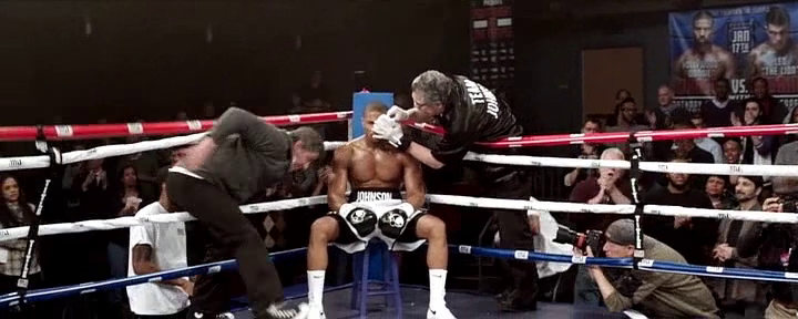
Creed ignited critics and audiences alike with its ingenious structure and its masterful directing. The film was able to respect the past Rocky franchise in a beautiful way, while also creating a new lane for itself. The film locations ranged from classic landmarks in Philadelphia to various training facilities and homes. Creed also featured three memorable boxing scenes which required an incredible amount of research, planning, and choreography.

In an exclusive interview with Interiors, we spoke with Hannah Beachler, who is the award winning Production Designer for Creed. The images and floor plans are property of Hannah Beachler and her team. 

INT: Can you talk about your history with the Rocky franchise? Did you grow up on the films? Did you discover them later on in life?

HB: I definitely grew up with the Rocky franchise.  I remember watching Rocky as a kid and being inspired.  My brothers and I would run around the house singing "Gonna Fly Now," so it was a big part of our childhood.  

INT: How did you become involved with Creed? Creed doesn’t mark your first collaboration with Ryan Coogler. What did you learn on your first project together that carried over into this one?

HB: Ryan and I worked together on Fruitvale Station. He texted me when he was scouting and said, "I'm scouting in Liverpool. Let's get you on this film." Ryan is a storyteller, an amazing visionary, and a friend. On Fruitvale Station, he built a family of filmmakers, he kept us going, and made us better at what we do. We all still stay in touch and support each other to this day, because of Ryan. That's the type of person he is. He's a good human and that changes you as a person -- and creatively, he's definitely made me better at my craft. Without question, I wanted to join him on Creed because I knew it would be something special.   

Rocky (1976) vs. Creed (2015)

INT: Did you revisit the previous six films in any kind of way in preparation for this one?

HB: Definitely. I watched Rocky, Rocky II, Rocky III, and Rocky IV - which is where our story begins. I studied the design in the first film quite a bit, which captured the essence of Philly and had a simplistic eloquence in its design. It was gritty and truthful about the neighborhood. I knew that was the essence of Creed. We knew Creed needed to honor the Rocky franchise, but also stand on its own.  

INT: Philadelphia is such a big part of the Rocky franchise. What was it like working in Philadelphia? What was the team looking for in Philadelphia that wasn’t there in the previous films?

HB: I loved Philly. It's a great city and I say that having spent the entire winter there! Philly had a great infrastructure and fantastic crew which made everything move a long quite easily. We spent a lot of time getting to know the neighborhoods and the people –  that was very important to Ryan. A lot of what we were trying to do was straddle the idea of an older generation and a newer generation, how they shared space and how that has affected the city. It was so interesting that there were few places you could go where you didn't see the old smoke stacks and abandoned factories, and at the same time you could see the new buildings of the CBD encroaching in on them, sort of rising up above the horizon and stating their presence. That was one of the main themes of Creed – the older generation passing on their knowledge and love to a newer generation.  

INT: Can you talk about the Front Street Gym?

HB: As soon as Ryan and I walked in, it was a visceral reaction to the space. We knew quite instantly that was the place where Rocky trains Adonis. We didn't do much to that space – posters on the walls and a little dressing here and there, but it offered itself to us in all its purity and it was beautiful. We had to shoot there and the producers and locations made that happen.   

Physical Model of Boxing Ring

INT: What was the process like designing the fight sequences? In other words, was the choreography of the fight designed according to the surrounding space or were they independent of one another?

HB: For the fight with Pretty Ricky (Tony Bellew), we really worked together to make the choreography, lighting, production design, and multiple cameras all work in the space. There was a lot of planning. We spent weeks on getting it just right and as authentic as possible, for both fights really, but the big fight was down to the ring girl chairs in the right place and the judges. It needed to be perfect. We used the regulation sized ring that Michael B. Jordan, Gabriel Rosado and Tony Bellew worked in with the fight choreographer for both fights. They trained relentlessly, everyday. So they had a feeling for the ring and knew it that everything they did in the ring wouldn't need to change or be adjusted. The first fight with Leo "The Lion" Sporino (Gabriel Rosado), the now infamous one-shot fight, was suppose to be a smaller fight, so some of that design was independent of the choreography, because the Steadicam was in the ring the whole time, for the most part.

Boxing Ring Floor Plan

INT: The film features a few long takes. Is this challenging in terms of space and are you designing the space with a moving camera in mind? Does this change the way you viewed other spaces throughout the film?

HB: I designed the whole of every space, so there wasn't anything that the camera couldn't see, or places the camera couldn't be, total 360. Ryan had layouts and plans for every set, and we would walk through with Maryse Alberti, the DP, and discuss what needed to be tweaked and talk about the scene from a technical angle and an emotional angle. Ryan has an amazing sense for where the camera should be and how he sees the scene playing out, which is a great blessing and made it easier for me to go in and make sure things were where they need to be. It didn't change the way I saw other spaces so much. We approached each space as its own story with its own needs.  

INT: Adonis has an interesting relationship with space in this film. Adonis’ apartment in Philadelphia consists of a mattress and a lamp. We see him living in different spaces but never know exactly what his personal space would look like. Is this something that was intentional?

HB: It was definitely intentional. We wanted Adonis to be finding himself throughout the film. He was never really settled and that's part his attraction to Bianca (Tessa Thompson). She was very sure of herself, driven, and had a place in the world. Her space was warm and lived in, where Adonis' spaces were cold and always something someone else wanted for him. It also made the three of them at Rocky's house feel more like family.  The spaces reflected the people and where they were in their lives when we meet them, whether it was moving forward, stuck in the past or never settled.  

Bianca's Apartment Floor Plan

Bianca's Apartment Inspiration

INT: It’s interesting that the physical proximity of Adonis and Bianca and them living in the same building is what brings them together. Can you talk about her apartment?

HB: I would say her apartment was one of my favorite sets. When Ryan and I first talked about it, he said he wanted her apartment to be the heart of the film, for it to feel like a different space from all the rest – and when she talks out the window to Rocky and Adonis, he wanted it to almost have this fairytale spin to it, like Rapunzel, but with a modern feel. Tessa and I talked one day for a couple hours about Bianca's apartment and how she saw Bianca, the kinds of details that would be in her apartment. I asked her to bring some of her personal belongings for us to put on the set and she brought quite a few things. I used flat paint in Bianca's apartment to soften the light hitting the walls, and we added a lot of architectural detail to elevate the space to the brownstone it used to be, instead of just painting the unattractive drywall. It had to feel like an upcoming musician lived there, who was an artist in every sense of the word, was young, and aspired to go beyond what she was at the moment. When Tessa walked in she grabbed me and said, “This feels like Bianca, it feels like she lives here." That is the best thing a Production Designer could ever hear. I have to give it up to Set Decorator Amanda Carroll too, as she did a fantastic job.

INT: We see Rocky Balboa’s apartment in this film. In a particularly great scene, we end on a shot of a turtle. Can you talk about that choice and its nod to the first Rocky film?  

HB: I think we searched for that location for about a month. We'd find something that could work and then it'd fall through for any one of a plethora of reasons and at the 11th hour we found the location we ended up using. We basically gutted a house from top to bottom and used every room except one, which you don't see. Paul Maiello, Construction Coordinator and Nell Stiffel, Scenic Charge, worked their magic in a very short amount of time. There was a huge question at one point if we use the house from Rocky Balboa a sort of continuation, but after much consideration, Ryan said, “Let's do our own thing.” So we started fresh with an entirely new house and new design. I wanted there to be a lot from Rocky's past in this space and, in fact there was a ton of stuff in there, you may not notice on the first watch. It was a delicate balance, to be sure. I didn't want it to be a museum but it need to feel like his life. We built the piece where you find Cuff and Link and, at first it was a bookshelf, and we put a couch in front of it. It was an incredibly small space as are most row houses in Philly, especially the older ones. I was looking at that particular build and I asked one of the carpenters to take the bookshelf out. After that, I like the openness it provided into the dining room, but I wanted to see something there that made sense. And then it hit me. I called the Amanda and told her we need a tank. She was like, “For fish?” and I said, “No, for turtles, with an old greenish florescent light in it, it should be old.” So in came the tank with the light. The turtles in it weren't the original Cuff and Link. They are still alive, but were too big for our tank, so we got stand ins, and in went the turtles and Sylvester Stallone loved it. I figured Rocky would have them still. And I loved that greenish florescent light. The shot of the turtles was all Ryan! So I'm glad I put them there, because that was a great moment.  

Hannah Beachler is an Award Winning Production Designer and has worked on various Films and Television Shows. You can visit her Website to see more of her work. Hannah Beachler is represented by DDA.