INTerview: Ethan Tobman (Room)

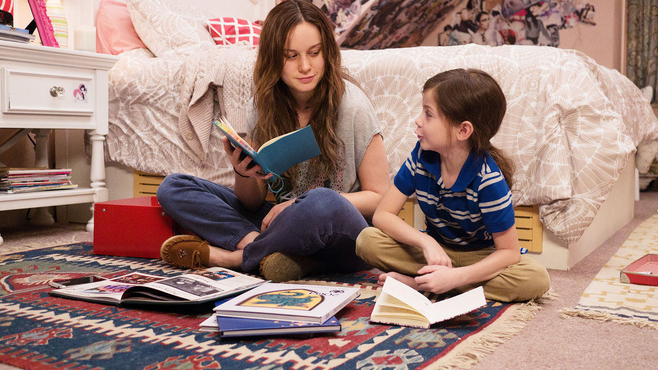
Room (2015), directed by Lenny Abrahamson, captivated audiences with its honest portrayal of Joy Newsome, a 24-year-old woman that is held captive for 7 years with the son she conceived with her kidnapper. Joy, who is played by Academy Award Winner, Brie Larson, tries to create a new world with her son, Jack, in this 10 x 10 foot-space.

Normally, a space like this would be incredibly challenging to create and shoot, but Ethan Tobman, the film's Production Designer, was able to masterfully build a dynamic space that felt interesting and warm on screen. Additionally, Tobman and his team constructed the room in such a way that allowed the Director unprecedented access.  

In an exclusive interview with Interiors, we spoke with Ethan Tobman, who is the Production Designer for Room. The images and floor plans are property of Ethan Tobman and his team.    

INT: We have heard you talk about the space of "Room" as an "inverted Rubik's Cube", where the floors, walls, and ceiling could all be removable. Was it always the idea that the room would be constructed in this way or did that change over time?

ET: While interviewing for “Room,” I was designing a fairly intricate job requiring math and pre-visualization: OK-Go’s “The Writing’s on the Wall.” So I approached the constraints as a riddle to be solved through geometry. How do you get 70 people on a film crew to fit in a space made for 2? I felt the answer was that you wouldn’t, but rather, I approached the set- as I mentioned before- as an inverted Rubik’s Cube: where every panel and every square could be removed from the outside, allowing us to peer in. This proved helpful both for the intimacy of performances and restricted us to create a very naturalistic environment.

INT: We have heard that the production stuck with the rule that every shot in the film should be achievable within the space itself. That's something that interests us a great deal, because you're being true to the space. How closely was this followed? Do you know of any instances where the team cheated the space in any way?

ET: Both director, Lenny Abrahamson, and cinematographer, Danny Cohen, were adamant about maintaining physical naturalism by avoiding the breaking of a 4th wall on camera. To that end, I’ve always been taught as a designer that your best work comes when you’re given a box to think outside of. Without restrictions, an artist is sometimes given too big a canvas to refine their brush strokes. As a result, we embraced the constrictions of our characters’ confinement within their literal physical space.

Even when the body of the camera was outside of room, the lens was purposefully inside it. Because of this, there is a real intimacy to the performances; we essentially made a movie peering into their environment.

Room Rendering

Room Rendering

Room Overhead Rendering

INT: What were some of the questions you had in mind after reading the script in terms of spaces and locations? What were some of your biggest concerns?

ET: I think all of our collective concerns as a creative team were in maintaining audience interest in one small space for over and hour. We would later laugh at this false instinct, and feel we weren’t given enough time to explore the chasms of history, and the nooks and details of their love within the confinement.

Due to the restriction of a minor’s hours on set, we found ourselves with time to kill; we shot an entire movie’s worth of inserts and still-life studies of objects in their confinement, and never felt we had repeated ourselves.

The thing about a world told from a child’s perspective is that each corner is a planet in a solar system. There are interiors within interiors. And so the space is essentially endless.

Room (2015)

INT: We've seen you say that one of the challenges you had was designing the exterior of "Room." It's interesting that Joy and Jack's "prison" is essentially an average shed in the backyard of an average home in an average neighborhood. In this sense, you're creating an entire world that has a seven year history in a space that exists onto itself. Can you speak about that?

ET: This was the most unexpectedly satisfying part of the creative process on “Room.” I focused obsessively on the interior without ever once considering the exterior, because Jack, likewise, had no sense of it. Once we had agreed upon the warmth, and richness, and layered life inside, I realized it was important to me to create an exterior that was entirely innocuous.

There is nothing special about Room from the outside; only Jack and Ma make it special on the inside. The horror of their confinement, and the richness of their bond, transcended the interior. When I presented it to Lenny, Danny and Brie, they were absolutely shocked. How could such a muted, small exterior capture so much life within it?-- That was precisely the reaction I wanted the audience to have.

Room (2015)

INT: In "Room," many of the items offer insight to the characters of Joy and Jack. Were there any items that were important to the characters that the audience may have missed? What were some items that made the space come alive?

ET: What’s important here in adapting a known piece of fiction is to add a layer of intelligence and heart to it, without detracting from its existing resonance.

We started imaginably, with drawings and games, and moved into more utilitarian objects that speak to a confinement’s function. Some of my favorite objects that never made it to screen were a deck of cards, hand-drawn on many different scraps of paper, grocery bags, and fabric. Also, a hole beneath the bed, that spoke to ma’s attempt to escape with a dull spoon. And finally, a schedule of every channel’s programming on TV that Jack would have spent years conceptualizing.

Room (2015)

INT: One of the most interesting aspects of the film is the way the story shifts once Joy and Jack have escaped from "Room". Somehow, the outside world feels more cold and scary than inside the "Room" for the two characters. How were you able to achieve that?

ET: What first attracted me to the project was the irony implicit in liberating prisoners only to introduce them to a very different sort of confinement. As a designer, my instinct was to approach this counter-intuitively. So, Room is a place that is warm. It is personal, it is layered, it is safe. Outside Room, the world is cold, impersonal, antiseptic, unsafe. I made some very conscious choices to introduce materials Jack would find disarmingly foreign, such as mottled glass, convex mirrors, plexi-glass, motion-sensor light-switches, cell phones, stainless steel, perforated ceiling tiles, condensation on windows.

For a young boy, experiencing these things for the first time, something innocuous to us would appear positively spellbinding to him. But what’s interesting about Jack is that he’s young enough that it will just as quickly become commonplace.

So, as a designer on this film, I found myself scouting locations and drawing sets outside of room with a mix of Jack’s indelible innocence and Ma’s quiet trauma.

Room (2015)

INT: Some of our favorite moments in the film are the interior shots of the hospital and Joy's parents' house. Did the architecture of this space dictate any decisions involving certain scenes or sequences?

ET: Very much so. We purposefully chose a Danish modern house with a particularly brutal bannister, employed wood-paneling and linear wallpaper, and shot these scenes framed as boxes within boxes. We were always cognizant of treating our liberated prisoners as inmates in a new prison. Lenny once said to me recently, “this is a movie about two homes. Room and Joy’s parents’ house.” In his quest to maintain the tension the first half of the film sets-up, we embraced the idea that the architecture, furniture choices and palette restrictions of the second half’s interiors had to mirror Room’s confinement, despite initially appearing as larger spaces.

Room Elevation Drawings

Room Light Study

INT: Interiors is an online publication about Architecture and Film. We construct and analyze floor plans of films, which is obviously one of the reasons why Room is such as fascinating film for us. Joy even highlights the word "space" when she says, "We don't have room -- space, enough space." Is there anything else you can share that may be of interest to us that we might appreciate?

ET: Jack says something so poetic to his grandmother in the film’s last act. Nancy (Joan Allen) asks him if room was small, Jack says “it went every direction, all the way to the end. It never finished. And Ma was always there.”

Room is the smallest set I’ve ever built. But in many ways, Lenny and Brie felt it was the largest they’ve ever inhabited. Every square inch needs to convey years of trauma, development and love. As a result, we approached life in Room through a series of experiments and extensive research. We did light studies to show how the sun would hit the walls at different times of year through one window. We watched Brie and Jack rehearse, and noted where he scratched and hit the walls. We tried to age the walls to show how he would have interacted with them at age 2 versus age 5; how his intelligence advances with his height. In all, there were 32 different colors of bleach and darkness on the tiles. And we tried to create a tapestry to convey the enormous intimacy time in Room afforded them.

The last night before we started shooting in Room, I actually spent a few hours there by myself, feeling something was missing. I had photos of Jack as a small child his parents had given me, and I started drawing them. I realized a mother with a small child would document his growth, regardless of not having a camera. I then cut the drawings up and made them into a giant tree collage. Lenny and Brie walked in on the first shoot day, and saw it for the first time, and we all agreed it needed to be there.

That’s why I’m a production designer instead of an architect.—I look for these little details that make people feel as we think. Those elusive details are what I love about storytelling.

Ethan Tobman is a Production Designer and has worked on various Films, Commercials and Music Videos. You can visit his Website to see more of his work. 

INTerview: Hannah Beachler (Creed)

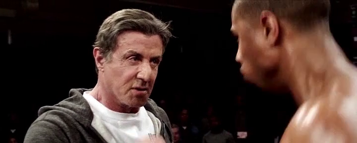
It's a difficult task taking on a sequel. It's even more difficult creating a sequel based on an incredibly respected franchise. Creed has the even more difficult task, considering its a spin-off that comes seventh in a franchise, the first film of which won the Oscar for Best Picture. Ryan Coogler, along with actor, Michael B. Jordan, however, got it right.

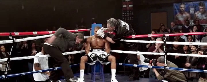
Creed ignited critics and audiences alike with its ingenious structure and its masterful directing. The film was able to respect the past Rocky franchise in a beautiful way, while also creating a new lane for itself. The film locations ranged from classic landmarks in Philadelphia to various training facilities and homes. Creed also featured three memorable boxing scenes which required an incredible amount of research, planning, and choreography.

In an exclusive interview with Interiors, we spoke with Hannah Beachler, who is the award winning Production Designer for Creed. The images and floor plans are property of Hannah Beachler and her team. 

INT: Can you talk about your history with the Rocky franchise? Did you grow up on the films? Did you discover them later on in life?

HB: I definitely grew up with the Rocky franchise.  I remember watching Rocky as a kid and being inspired.  My brothers and I would run around the house singing "Gonna Fly Now," so it was a big part of our childhood.  

INT: How did you become involved with Creed? Creed doesn’t mark your first collaboration with Ryan Coogler. What did you learn on your first project together that carried over into this one?

HB: Ryan and I worked together on Fruitvale Station. He texted me when he was scouting and said, "I'm scouting in Liverpool. Let's get you on this film." Ryan is a storyteller, an amazing visionary, and a friend. On Fruitvale Station, he built a family of filmmakers, he kept us going, and made us better at what we do. We all still stay in touch and support each other to this day, because of Ryan. That's the type of person he is. He's a good human and that changes you as a person -- and creatively, he's definitely made me better at my craft. Without question, I wanted to join him on Creed because I knew it would be something special.   

Rocky (1976) vs. Creed (2015)

INT: Did you revisit the previous six films in any kind of way in preparation for this one?

HB: Definitely. I watched Rocky, Rocky II, Rocky III, and Rocky IV - which is where our story begins. I studied the design in the first film quite a bit, which captured the essence of Philly and had a simplistic eloquence in its design. It was gritty and truthful about the neighborhood. I knew that was the essence of Creed. We knew Creed needed to honor the Rocky franchise, but also stand on its own.  

INT: Philadelphia is such a big part of the Rocky franchise. What was it like working in Philadelphia? What was the team looking for in Philadelphia that wasn’t there in the previous films?

HB: I loved Philly. It's a great city and I say that having spent the entire winter there! Philly had a great infrastructure and fantastic crew which made everything move a long quite easily. We spent a lot of time getting to know the neighborhoods and the people –  that was very important to Ryan. A lot of what we were trying to do was straddle the idea of an older generation and a newer generation, how they shared space and how that has affected the city. It was so interesting that there were few places you could go where you didn't see the old smoke stacks and abandoned factories, and at the same time you could see the new buildings of the CBD encroaching in on them, sort of rising up above the horizon and stating their presence. That was one of the main themes of Creed – the older generation passing on their knowledge and love to a newer generation.  

INT: Can you talk about the Front Street Gym?

HB: As soon as Ryan and I walked in, it was a visceral reaction to the space. We knew quite instantly that was the place where Rocky trains Adonis. We didn't do much to that space – posters on the walls and a little dressing here and there, but it offered itself to us in all its purity and it was beautiful. We had to shoot there and the producers and locations made that happen.   

Physical Model of Boxing Ring

INT: What was the process like designing the fight sequences? In other words, was the choreography of the fight designed according to the surrounding space or were they independent of one another?

HB: For the fight with Pretty Ricky (Tony Bellew), we really worked together to make the choreography, lighting, production design, and multiple cameras all work in the space. There was a lot of planning. We spent weeks on getting it just right and as authentic as possible, for both fights really, but the big fight was down to the ring girl chairs in the right place and the judges. It needed to be perfect. We used the regulation sized ring that Michael B. Jordan, Gabriel Rosado and Tony Bellew worked in with the fight choreographer for both fights. They trained relentlessly, everyday. So they had a feeling for the ring and knew it that everything they did in the ring wouldn't need to change or be adjusted. The first fight with Leo "The Lion" Sporino (Gabriel Rosado), the now infamous one-shot fight, was suppose to be a smaller fight, so some of that design was independent of the choreography, because the Steadicam was in the ring the whole time, for the most part.

Boxing Ring Floor Plan

INT: The film features a few long takes. Is this challenging in terms of space and are you designing the space with a moving camera in mind? Does this change the way you viewed other spaces throughout the film?

HB: I designed the whole of every space, so there wasn't anything that the camera couldn't see, or places the camera couldn't be, total 360. Ryan had layouts and plans for every set, and we would walk through with Maryse Alberti, the DP, and discuss what needed to be tweaked and talk about the scene from a technical angle and an emotional angle. Ryan has an amazing sense for where the camera should be and how he sees the scene playing out, which is a great blessing and made it easier for me to go in and make sure things were where they need to be. It didn't change the way I saw other spaces so much. We approached each space as its own story with its own needs.  

INT: Adonis has an interesting relationship with space in this film. Adonis’ apartment in Philadelphia consists of a mattress and a lamp. We see him living in different spaces but never know exactly what his personal space would look like. Is this something that was intentional?

HB: It was definitely intentional. We wanted Adonis to be finding himself throughout the film. He was never really settled and that's part his attraction to Bianca (Tessa Thompson). She was very sure of herself, driven, and had a place in the world. Her space was warm and lived in, where Adonis' spaces were cold and always something someone else wanted for him. It also made the three of them at Rocky's house feel more like family.  The spaces reflected the people and where they were in their lives when we meet them, whether it was moving forward, stuck in the past or never settled.  

Bianca's Apartment Floor Plan

Bianca's Apartment Inspiration

INT: It’s interesting that the physical proximity of Adonis and Bianca and them living in the same building is what brings them together. Can you talk about her apartment?

HB: I would say her apartment was one of my favorite sets. When Ryan and I first talked about it, he said he wanted her apartment to be the heart of the film, for it to feel like a different space from all the rest – and when she talks out the window to Rocky and Adonis, he wanted it to almost have this fairytale spin to it, like Rapunzel, but with a modern feel. Tessa and I talked one day for a couple hours about Bianca's apartment and how she saw Bianca, the kinds of details that would be in her apartment. I asked her to bring some of her personal belongings for us to put on the set and she brought quite a few things. I used flat paint in Bianca's apartment to soften the light hitting the walls, and we added a lot of architectural detail to elevate the space to the brownstone it used to be, instead of just painting the unattractive drywall. It had to feel like an upcoming musician lived there, who was an artist in every sense of the word, was young, and aspired to go beyond what she was at the moment. When Tessa walked in she grabbed me and said, “This feels like Bianca, it feels like she lives here." That is the best thing a Production Designer could ever hear. I have to give it up to Set Decorator Amanda Carroll too, as she did a fantastic job.

INT: We see Rocky Balboa’s apartment in this film. In a particularly great scene, we end on a shot of a turtle. Can you talk about that choice and its nod to the first Rocky film?  

HB: I think we searched for that location for about a month. We'd find something that could work and then it'd fall through for any one of a plethora of reasons and at the 11th hour we found the location we ended up using. We basically gutted a house from top to bottom and used every room except one, which you don't see. Paul Maiello, Construction Coordinator and Nell Stiffel, Scenic Charge, worked their magic in a very short amount of time. There was a huge question at one point if we use the house from Rocky Balboa a sort of continuation, but after much consideration, Ryan said, “Let's do our own thing.” So we started fresh with an entirely new house and new design. I wanted there to be a lot from Rocky's past in this space and, in fact there was a ton of stuff in there, you may not notice on the first watch. It was a delicate balance, to be sure. I didn't want it to be a museum but it need to feel like his life. We built the piece where you find Cuff and Link and, at first it was a bookshelf, and we put a couch in front of it. It was an incredibly small space as are most row houses in Philly, especially the older ones. I was looking at that particular build and I asked one of the carpenters to take the bookshelf out. After that, I like the openness it provided into the dining room, but I wanted to see something there that made sense. And then it hit me. I called the Amanda and told her we need a tank. She was like, “For fish?” and I said, “No, for turtles, with an old greenish florescent light in it, it should be old.” So in came the tank with the light. The turtles in it weren't the original Cuff and Link. They are still alive, but were too big for our tank, so we got stand ins, and in went the turtles and Sylvester Stallone loved it. I figured Rocky would have them still. And I loved that greenish florescent light. The shot of the turtles was all Ryan! So I'm glad I put them there, because that was a great moment.  

Hannah Beachler is an Award Winning Production Designer and has worked on various Films and Television Shows. You can visit her Website to see more of her work. Hannah Beachler is represented by DDA.

INTerview: Bruce Robert Hill (The Last Man on Earth)

If one were to think of the post-apocalyptic genre, they would most likely imagine a dark, sci-fi drama set in the distant future. In fact, 9 times of 10, that would be the case.

The critically-acclaimed television series, The Last Man on Earth, is able to inject brilliant humor into a relatively dark subject matter in a unique and creative way. The series is created by Executive Producer, Writer and lead Actor, Will ForteThe Last Man on Earth is the type of show that opens a new door to architectural analysis in cinema and television.

The show alters many things that we're used to with the genre, but in inventive ways -- from showing the protagonist stealing artwork and artifacts from museums, to showing a group of survivors living in their own personal mansion in Southern California. The show is able to create a brilliant architectural and psychological discussion about space and how people use it, while still being humorous.

In an exclusive interview with Interiors, we talked to production designer, Bruce Robert Hill. The drawings, renderings, and photographs used in the show are property of Bruce Robert Hill and his team.

Warning: Minor Spoilers Below

INT: You've mentioned that you did extensive research on the Post-Apocalyptic genre. Even though The Last Man on Earth has more of a comedic take on this category, was there anything interesting that you realized about these fictional dystopian worlds in terms of Architecture/Design?

BH: I have long been a fan of the post-apocalyptic genre. It’s a chilling reality to explore and has always been fascinating to me. To take this genre and layer over it the narrative of the single cam comedy is brilliant. From an architectural and design standpoint, I feel that realism helps fortify the comedy here. It is a post-apocalyptic world, but it is still the world that we come from. We approached the design and architecture in The Last Man on Earth with this in mind.

INT: The first season was brilliant in the ways that different parts of the country were shown, especially the McMansions in Tucson, Arizona. Was Phil's housing community modeled after anywhere specific? Or was it always supposed to feel generic?

BH: Yes the McMansion sensibility and the location of Tucson, Arizona was a big part of the first season. The excesses of our culture and the inflated design sensibility of that gated McMansion world, set in the desolate climate of Arizona, seemed to be a perfect place for the character, Phil Miller, to land.   The creator/writer/producer/star, Will Forte specifically chose Tucson as the setting of the show. Aside from being a comical and terribly misguided choice as a place to survive after the pandemic, Tucson surrounds our characters with a desolate environment that helps play up the hopelessness that these survivors are feeling. The choice to go with a more opulent gated community that has been cut off from electricity and running water helps accentuate the absurd level to which our society has disconnected itself from the earth. We film this show in Los Angeles. The closest local area here that resembles Tucson is Chatsworth, located in the northwest corner of the San Fernando Valley. This is where we filmed a lot of the first season and where we found our gated McMansion community exterior. We based the design of the interior stage sets on these overblown and opulent houses.

INT: Because this is a fictional dystopian world, was it challenging having to find other locations besides Phil's house? (i.e. O'Rozco's Bar & Grille, Silvers Hardware). Or in a way, did you have more freedom because you could choose a wide range of locations since everything is available in this world?

BH: Yes. In a way, the world is Phil’s oyster. He is a kid in a candy store and the owner of that candy store died in the pandemic. This is a great layer to the comedy of The Last Man on Earth. What would you do if no one were around? We, of course, are limited by budget and, to some degree, to what is close to our studio here in Chatsworth. That said, we could also lean on the visual effects department to remove the living world from frame if we wanted to use a location that is not completely deserted. If we like a location and there are living things around, we can simply take them out in post production to keep our world deserted and void of life.

INT: You and your team masterfully built a physical set of the cul-de-sac where Phil lives. Did any design or production decisions revolutionize once you knew you were in full control of all the elements?

BH: We actually had a virtual 3D model of the cul-de-sac built by an excellent visual effect house, CBS Digital, to surround the practical cul-de-sac asphalt footprint that we created on stage. The finished virtual cul-de-sac was fed to the monitors and the camera viewfinder so that we could see how the foreground set dressing and the actors gelled with the 3D model in real time. It was an incredible tool that allowed us greater freedom to film on stage without the constraints of filming on a location.

INT: The first season mostly looked at Tucson, Arizona and the second season seems to be more focused on Malibu, California. What do you think it says about the characters in the show that they moved up to larger spaces and a more opulent area?

BH: The group split at the end of the first season. The others went west to Malibu and after some awkward reconciliation, Carol and Phil (Tandy) eventually reunite with them. I'm not sure, but it feels to me that the group simply wanted to get to a more pleasant climate than Tucson and find a very comfortable place to live. After Phil (Tandy) and Carol left they probably woke up and said, “what the hell are we doing in Tucson!”

INT: Overall, the production design is exceptional because it is able to capture realness without being over the top. What was the biggest challenge you had in trying to balance the line between being authentic and being too dark?

BH: I actually don't shy away from the dark side. I believe that the darkness helps to sell the authenticity of this pandemic world and ultimately helps intensify the comedy. Comedy can be dark and real and I think when you blur those lines the comedy hits you more deeply. Comedy comes from a deep and real place. At least good comedy does.

Bruce Robert Hill is a Production Designer and Art Director and has worked on various Films and Television Shows. You can visit his Website to see more of his work. 

INTerview: Amy Williams (Master of None)

Smart. Funny. Honest. These are the words that many have used to describe the new critically-acclaimed television show, Master of None, which debuted on Netflix on November 6th, 2015. Co-Created by Aziz Ansari and Alan Yang, the show is an honest depiction of an actor, played by Aziz Ansari, trying to make his way through life.

Master of None is the type of television show that transcends the genre. In a time where quality television programming is abundant, Master of None seems to stand out above the rest. Furthermore, one of the most captivating aspects of the show is its beautiful interior and exterior locations. These locations portray an honest depiction of New York City and this honesty goes hand in hand with the sincerity of the show.  

In an exclusive interview with Interiors, we talked to Amy Williams, who is an Emmy award winning Production Designer as well as the Production Designer for Master of None.  The Renderings and Floor Plans are property of Amy Williams and her team. 

INT: First off, we were curious how the opportunity to do the show, Master of None, came about? What was it about it that made you want to work on it?

AW: I was initially contacted to meet for the show by Gwen Bialic, a producer I had worked with on a past feature film. She brought me in to interview with the creators, Aziz Ansari and Alan Yang, because they were looking for a designer with indie film roots. I think they also wanted someone who truly knew and understood life in NYC. When we met back in January, they spoke about how they were drawn to a 1970s New York City cinematic look for the show. They wanted it to feel different and more realistic from everything else out there in the comedy realm.  It was important to steer clear of the overly lit, bright and happy looking comedies that have become commonplace.  The creators had a high aesthetic standard which was hugely appealing as a designer.  I’ve lived in NYC for 15 years and this seemed a wonderful opportunity to express and represent our shared “New York” experiences.

INT: The show has been receiving an incredible amount of attention and many critics are praising it for its honesty. A lot of that honesty is shown with your depiction of New York City and how real it feels. Was that the goal from the beginning? To create a honest representation of the city?

AW: That was the goal, exactly. NYC is a big character in the show and we wanted to represent it well, especially for those who know it intimately. 

Master of None (Episode 2 "Parents")

India House Floor Plan

India House Rendering

INT: Your website discusses part of your process, which involves using reference images to creating a lookbook to building a floor plan and creating an overall layout of a space. Was this process used for any locations in Master of None?

AW: Absolutely. Creating lookbooks and sharing images is an important tool. It’s the best way to communicate to the network, producers, directors and creators what I envision and hope to achieve for the overall look of a certain set or location. Once we land in agreement, I then use these lookbooks to translate this vision to my team of decorators, set builders, scenic artists and props people. I'm particularly proud of our work for Dev's Apartment Set and the flashback scenes sets in India and Taiwan for Episode 102 "Parents".

INT: All of the locations used in Master of None seem extremely thought-out. Was there a particular Architectural Design style that you were going for? If so, what was your inspiration for these locations?

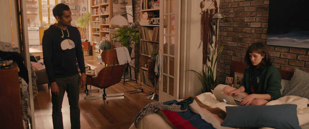
AW: Realistic, historic and sentimental were my particular aims with locations and design. 1970s and 80s Downtown/East Village imagery set the foundation for the look in terms of color palette and overall tone. But as you will see, NYC through the ages is represented, from downtown tenement buildings to the current urban rustic vibe.  Within Dev's apartment, you can see an eclectic design sense true to that of the character's many interests. From a collection of vintage Polaroid cameras, Mid-century Modern furniture pieces, Turn of the century lighting fixtures, 1970s space age electronics and lighting, Eastern European Communist era clocks, 1980s and 90s toys and games and even primitive rustic objects of interest.

INT: Some of my favorite sequences on the show are the "Walk and Talk" scenes with Dev and one of his friends in a brief conversation (Episode 2 "Parents", Episode 5 "The Other Man" and Episode 6 "Nashville") Was there any additional planning that went into these specific scenes? I'm curious if the location affected the way in which those sequences were shot.

AW: We spent a lot of time exploring certain neighborhoods and streets to find locations that would fit both the mood and tone of a particular scene. The goal was, as always, to be true to those that dwell in downtown NYC & parts of Brooklyn.  

With Nashville, we tried to feature the more interesting "tourist" spots. The types of places Dev and Rachel might explore within a short 24-hour period while in Music City. The bars, stores, restaurants and streets were all carefully selected based on my previous filming experience in Nashville as well as recommendations from our local friends. The following locations were showcased in the episode; the rooftop at Acme Feed & Seed, Manuel's Couture Shop, Santa's Pub, Robert's Western World, Printers Alley and the Hermitage Hotel to name a few.

INT: There's a strong focus on food and drinks in the show. As a result, the show contains amazing Commercial Spaces and interesting Restaurants and Bars. What was your process like in selecting these spaces? Were you looking for anything specific?

AW: Again, the goal is to “keep it real” and these real bars and restaurants are all places we know and love in our own NYC lives. Plus Aziz and Alan are massive gastronomes so we chose spots that they often patronize.  Jeff Brown, our location manager, and I spent a lot of time making sure that these were places that represented a certain timeless and sentimental feel for New York.

Dev's Apartment Inspiration

Dev's Apartment Rendering

Dev's Apartment Rendering

Dev's Apartment Floor Plan

Master of None (Episode 9 "Mornings")

INT: Our favorite episode, Episode 9 "Mornings", takes place completely in Dev's apartment and tracks Dev (Aziz Ansari) and Rachel (Noël Wells) over an 11 month period. The episode is phenomenal in terms of writing but also in the ways in which the apartment is shown and used. Was there any additional planning involved for this particular episode? 

AW: As soon as I started designing Dev’s apartment I knew we needed to plan a space with episode 109 in mind. The script for that episode was still under wraps, but Aziz and Alan explained the premise and the certain detail elements that the apartment needed for this bottle episode. With that in mind, we expanded the original size of space to provide ample shooting options and angles for the actors and camera.  I worked with Aziz for weeks sharing images and ideas from our own personal NYC dwellings to achieve a space that was real, aspirational and to his aesthetic preferences.

Amy Williams is an Emmy Award Winning Production Designer and has worked on various Films, Television Shows, Commercials and Music Videos. You can visit her Website and Twitter to see more of her work. 

INTerview: Fred Birchal

I first saw the work of Brazilian artist, Frederico Birchal, in 2013. He had just introduced his 'Famous Costumes' series, which looked at the outfits of famous celebrities. It was such a unique, creative idea and the graphics were amazing as well. Fast forward to 2015 and Frederico Birchal is back with another amazing art series called 'Famous Movies & TV Shows Setting'. In this series, Birchal has recreated architectural elevations from famous films and television shows. 

In an exclusive interview with Interiors, we talked to Frederico Birchal about his art and his latest series. 

INT: Your series, Famous Movies & TV Shows Settings, looks at Architectural Elevations from various films and TV shows. What made you want to capture the facade of these spaces?

FB: In my work, I always try to get people to pay attention to the details, specifically, objects that nobody notices. My latest series wasn't any different. I tried to show the maximum amount of details for various movie locations. These locations have a great expressiveness and they are where many things take place. Each place is a thought out location so the audience can recognize it as part of the movie. I think they are extremely important and the details cannot go unnoticed. 

INT: Some of your earlier work covered famous costumes/outfits and even famous vehicles. Now that you've examined Architecture, is there another area that you'd like to explore?

FB: Every object that represents something serves as an inspiration to me. Because of this, I want to explore other areas, but I do not know what my next series will be. Recently, I have been thinking about alternative transportation devices, such as the Tardis from Doctor Who and Pee Wee Herman’s bicycle.
 

INT: Your selections range from The Grand Budapest Hotel to Breaking Bad to Star Wars. Was there a process in which the Movies and Shows were selected? Which one is your favorite?

FB: The selection process consists of thinking about movies and television shows in which the locations express the plot. For example, The Grand Budapest Hotel is a movie where most of the plot happens in a specific place. After that, I think about the beauty and the details of each location. Finally, I think about things like how the public connects to each movie or television show. It’s hard to choose a single favorite, but the ones you mentioned are some of my favorites. 

INT: Will you continue this series with additional Films and Television Shows? If so, which ones are you most interested in creating next?

FB: I do intend to continue, but I still don’t know when or what I will do. I only know that it will have the house from Crimson’s Peak.

Fred Birchal is a Designer and Illustrator. For more of his work, please visit his Website and Online Store